68 11.3 Measuring Earthquakes
There are two main ways to measure earthquakes. The first of these is an estimate of the energy released, and the value is referred to as magnitude. This is the number that is typically used by the press when a big earthquake happens. It is often referred to as “Richter magnitude,” but that is a misnomer, and it should be just “magnitude.” There are many ways to measure magnitude—including Charles Richter’s method developed in 1935—but they are all ways to estimate the same number, which is proportional to the amount of energy released.
The other way of assessing the impact of an earthquake is to assess what people felt and how much damage was done. This is known as intensity. Intensity values are assigned to locations, rather than to the earthquake itself, and therefore intensity can vary widely, depending on the proximity to the earthquake and the types of materials underneath and the local conditions.
Earthquake Magnitude
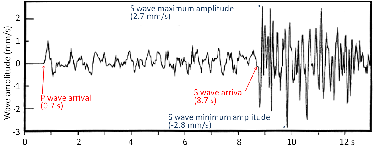
Before we look more closely at magnitude we need to review what we know about body waves, and look at surface waves. Body waves are of two types, P waves, or primary or compression waves (like the compression of the coils of a spring), and S waves, or secondary or shear waves (like the flick of a rope). An example of P and S seismic wave records is shown in Figure 11.3.1. The critical parameters for the measurement of magnitude are labelled, including the time interval between the arrival of the P- and S-waves—which is used to determine the distance from the earthquake to the seismic station, and the amplitude of the S-waves—which is used to estimate the magnitude of the earthquake.
When body waves (P or S) reach Earth’s surface, some of their energy is transformed into surface waves, of which there are two main types, as illustrated in Figure 11.3.2. Rayleigh waves are characterized by vertical motion of the ground surface, like waves on water, while Love waves are characterized by horizontal motion. Both Rayleigh and Love waves are about 10% slower than S-waves (so they arrive later at a seismic station). Surface waves typically have greater amplitudes than body waves, and they do more damage.

Other important terms for describing earthquakes are hypocentre (or focus) and epicentre. The hypocentre is the actual location of an individual earthquake shock at depth in the ground, and the epicentre is the point on the land surface vertically above the hypocentre (Figure 11.3.3).

A number of methods for estimating magnitude are listed in Table 11.1. Local magnitude (ML) was widely used until late in the 20th century, but moment magnitude (MW) is now more commonly used because it gives more accurate estimates (especially with larger earthquakes) and can be applied to earthquakes at any distance from a seismometer. Surface-wave magnitudes can also be applied to measure distant large earthquakes.
Because of the increasing size of cities in earthquake-prone areas (e.g., China, Japan, California) and the increasing sophistication of infrastructure, it is becoming important to have very rapid warnings and magnitude estimates of earthquakes that have already happened. This can be achieved by using P-wave data to determine magnitude because P-waves arrive first at seismic stations, in many cases several seconds ahead of the more damaging S-waves and surface waves. Operators of electrical grids, pipelines, trains, and other infrastructure can use the information to automatically shut down systems so that damage and casualties can be limited.
| [Skip Table] | |||
| Type | M Range | Dist. Range | Comments |
|---|---|---|---|
| Local or Richter (ML) | 2 to 6 | 0 to 400 kilometres | The original magnitude relationship defined in 1935 by Richter and Gutenberg. It is based on the maximum amplitude of S-waves recorded on a Wood‑Anderson torsion seismograph. ML values can be calculated using data from modern instruments. L stands for local because it only applies to earthquakes relatively close to the seismic station. |
| Moment (MW) | Greater than 3.5 | All | Based on the seismic moment of the earthquake, which is equal to the average amount of displacement on the fault times the fault area that slipped. It can also be estimated from seismic data if the seismometer is tuned to detect long-period body waves. |
| Surface wave (MS) | 5 to 8 | 20 to 180° | A magnitude for distant earthquakes based on the amplitude of surface waves measured at a period near 20 seconds. |
| P-wave | 2 to 8 | Local | Based on the amplitude of P-waves. This technique is being increasingly used to provide very rapid magnitude estimates so that early warnings can be sent to utility and transportation operators to shut down equipment before the larger (but slower) S-waves and surface waves arrive. |
Exercise 11.2 Moment magnitude estimates from earthquake parameters
Use this moment magnitude calculation tool to estimate the moment magnitude based on the approximate length, width, and displacement values provided in the following table:
| [Skip Table] | ||||
| Length (kilometres) | Width (kilometres) | Displacement (metres) | Earthquake | MW? |
|---|---|---|---|---|
| 60 | 15 | 4 | The 1946 Vancouver Island earthquake | |
| 0.4 | 0.2 | .5 | The small Vancouver Island earthquake shown in Figure 11.3.1 | |
| 20 | 8 | 4 | The 2001 Nisqually earthquake described in Exercise 11.3 | |
| 1,100 | 120 | 10 | The 2004 Indian Ocean earthquake | |
| 30 | 11 | 4 | The 2010 Haiti earthquake | |
The largest recorded earthquake had a magnitude of 9.5. Could there be a 10? You can answer that question using this tool. See what numbers are needed to make MW = 10. Are they reasonable?
See Appendix 3 for Exercise 11.2 answers.
The magnitude scale is logarithmic; in fact, the amount of energy released by an earthquake of M4 is 32 times higher than that released by one of M3, and this ratio applies to all intervals in the scale. If we assign an arbitrary energy level of 1 unit to a M1 earthquake the energy for quakes up to M8 will be as shown on the following table:
| Magnitude | Energy |
|---|---|
| 1 | 1 |
| 2 | 32 |
| 3 | 1,024 |
| 4 | 32,768 |
| 5 | 1,048,576 |
| 6 | 33,554,432 |
| 7 | 1,073,741,824 |
| 8 | 34,359,738,368 |
In any given year, when there is a large earthquake on Earth (M8 or M9), the amount of energy released by that one event will likely exceed the energy released by all smaller earthquake events combined.
Earthquake Intensity
The intensity of earthquake shaking at any location is determined not only by the magnitude of the earthquake and its distance, but also by the type of underlying rock or unconsolidated materials. If buildings are present, the size and type of buildings (and their inherent natural vibrations) are also important.
Intensity scales were first used in the late 19th century, and then adapted in the early 20th century by Giuseppe Mercalli and modified later by others to form what we know call the modified Mercalli intensity scale (Table 11.4). Intensity estimates are important because they allow us to characterize parts of any region into areas that are especially prone to strong shaking versus those that are not. The key factor in this regard is the nature of the underlying geological materials, and the weaker those are, the more likely it is that there will be strong shaking. Areas underlain by strong solid bedrock tend to experience much less shaking than those underlain by unconsolidated river or lake sediments.
| [Skip Table] | |
| Level of intensity | Description |
|---|---|
| Not felt (1) | Not felt except by a very few under especially favourable conditions |
| Weak (2) | Felt only by a few persons at rest, especially on upper floors of buildings |
| Weak (3) | Felt quite noticeably by persons indoors, especially on upper floors of buildings; many people do not recognize it as an earthquake; standing motor cars may rock slightly; vibrations similar to the passing of a truck; duration estimated |
| Light (4) | Felt indoors by many, outdoors by few during the day; at night, some awakened; dishes, windows, doors disturbed; walls make cracking sound; sensation like heavy truck striking building; standing motor cars rocked noticeably |
| Moderate (5) | Felt by nearly everyone; many awakened; some dishes, windows broken; unstable objects overturned; pendulum clocks may stop |
| Strong (6) | Felt by all, many frightened; some heavy furniture moved; a few instances of fallen plaster; damage slight |
| Very Strong (7) | Damage negligible in buildings of good design and construction; slight to moderate in well-built ordinary structures; considerable damage in poorly built or badly designed structures; some chimneys broken |
| Severe (8) | Damage slight in specially designed structures; considerable damage in ordinary substantial buildings with partial collapse; damage great in poorly built structures; fall of chimneys, factory stacks, columns, monuments, walls; heavy furniture overturned |
| Violent (9) | Damage considerable in specially designed structures; well-designed frame structures thrown out of plumb; damage great in substantial buildings, with partial collapse; buildings shifted off foundations |
| Extreme (10) | Some well-built wooden structures destroyed; most masonry and frame structures destroyed with foundations; rails bent |
| Extreme (11) | Few, if any (masonry), structures remain standing; bridges destroyed; broad fissures in ground; underground pipelines completely out of service; earth slumps and land slips in soft ground; rails bent greatly |
| Extreme (12) | Damage total; waves seen on ground surfaces; lines of sight and level distorted; objects thrown upward into the air |
An example of this effect is the 1985 M8 earthquake that struck the Michoacán region of western Mexico, southwest of Mexico City. There was relatively little damage in the area around the epicentre, but there was tremendous damage and about 5,000 deaths in heavily populated Mexico City some 350 kilometres from the epicentre. The key reason for this is that Mexico City was built largely on the unconsolidated and water-saturated sediment of former Lake Texcoco. These sediments resonate at a frequency of about two seconds, which was similar to the frequency of the body waves that reached the city. For the same reason that a powerful opera singer can break a wine glass by singing the right note, the amplitude of the seismic waves was amplified by the lake sediments. Survivors of the disaster recounted that the ground in some areas moved up and down by about 20 centimetres every two seconds for over two minutes. Damage was greatest to buildings between 5 and 15 storeys tall, because they also resonated at around two seconds, which amplified the shaking.
Exercise 11.3 Estimating intensity from personal observations
The following observations were made by residents of the Nanaimo area during the M6.8 Nisqually earthquake near Olympia, Washington in 2001. Estimate the Mercalli intensities using Table 11.4.
| [Skip Table] | |||||
| Building Type | Floor | Shaking Felt | How long it lasted (in seconds) | Description of Motion | Intensity? |
|---|---|---|---|---|---|
| House | 1 | no | 10 | Heard a large rumble lasting not even 10 seconds, mirror swayed | |
| House | 2 | moderate | 60 | Candles, pictures and CDs on bookshelf moved, towels fell off racks | |
| House | 1 | no | Pots hanging over stove moved and crashed together | ||
| House | 1 | weak | Rolling feeling with a sudden stop, picture fell off mantle, chair moved | ||
| Apartment | 1 | weak | 10 | Sounded like a big truck then everything shook for a short period | |
| House | 1 | moderate | 20-30 | Teacups rattled but didn’t fall off | |
| Institution | 2 | moderate | 15 | Creaking sounds, swaying movement of shelving | |
| House | 1 | moderate | 15-30 | Bed banging against the wall with me in it, dog barking aggressively | |
See Appendix 3 for Exercise 11.3 answers.
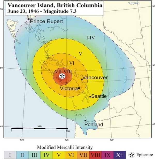
An intensity map for the 1946 M7.3 Vancouver Island earthquake is shown in Figure 11.3.4. The intensity was greatest in the central island region where, in some communities, chimneys were damaged on more than 75% of buildings, some roads were made impassable, and a major rock slide occurred. The earthquake was felt as far north as Prince Rupert, as far south as Portland Oregon, and as far east as the Rockies.
Image Descriptions
Figure 11.3.1 image description: P-waves and S-waves from a small (M4) earthquake near Vancouver Island in 1997. The P-wave arrived in 0.7 seconds with an amplitude ranging from negative 0.7 millimetres per second to 1.1 millimetres per second and lasting until the arrival of the S-wave. The S-wave arrived at 8.7 seconds, with a minimum amplitude of negative 2.8 millimetres per second and a maximum amplitude of 2.7 millimetres per second. The S-wave’s net amplitude gradually decreased over the next 5 seconds. [Return to Figure 11.3.1]
Figure 11.3.4 image description: The graduated intensity of the 1945 M7.3 Vancouver Island earthquake based on the modified Mercalli intensity scale. The area surrounding the epicentre of the earthquake which included central Vancouver Island ranged between a very strong (7) and severe (8) intensity. The next ring included the northern and southern parts of Vancouver Island, as well as a part of the main land coast including Vancouver and much of the Sunshine coast a strong (6) intensity. The next ring, which reached experienced a moderate (5) intensity, included Seattle and much of the BC interior. The outermost ring ranged between not felt (1) and light (4) intensity. It was felt as far north as Prince Rupert and the southern tip of Haida Gwaii, south eastern BC, and as far south as north western Oregon. [Return to Figure 11.3.4]
Media Attributions
- Figure 11.3.1: © Steven Earle. CC BY.
- Figure 11.3.2 (left): “Rayleigh Wave.” Adapted by Steven Earle. Public domain.
- Figure 11.3.2 (right): “Love Wave” © Nicoguaro. Adapted by Steven Earle. CC BY.
- Figure 11.3.3: © Steven Earle. CC BY.
- Figure 11.3.4: “Vancouver Island, British Columbia June 23, 1946 – Magnitude 7.3,” © National Resources Canada. Used under the terms allowing for non-commercial reproduction. This reproduction is a copy of an official work that is published by the Government of Canada. This reproduction has not been produced in affiliation with, or with the endorsement of the Government of Canada.
Text Attributions
- Table 11.4: The modified Mercalli intensity scale © Wikipedia. Adapted by Steven Earle. CC BY-SA.
- Table 11.1 by Steven Earle. ↵
Sea-level change has been a feature on Earth for as long as there have been oceans (billions of years), and it has important implications for coastal processes and both erosional and depositional features. There are three main mechanisms of sea-level change, as described below.
Eustatic sea-level changes are global sea-level changes related either to changes in the volume of glacial ice on land or to changes in the shape of the sea floor caused by plate tectonic processes. For example, changes in the rate of mid-ocean spreading will change the shape of the sea floor near the ridges, and this affects sea level.

Over the past 20,000 years, there has been approximately 125 m of eustatic sea-level rise due to glacial melting. Most of that took place between 15,000 and 7,500 years ago during the major melting phase of the North American and Eurasian Ice Sheets (Figure 17.4.1). During that time the average rate of sea level rise was approximately 14 mm/y. At around 7,500 years ago, the rate of glacial melting and sea-level rise decreased dramatically. The average rate over the past 6000 years has been 0.5 mm/y. Anthropogenic climate change led to accelerating sea-level rise starting around 1870. Since then the average rate has been about 1.1 mm/y, but it has been gradually increasing. The current rate is over 3 mm/y.
Isostatic sea-level changes are local changes caused by subsidence or uplift of the crust related either to changes in the amount of ice on the land, or to growth or erosion of mountains.
Almost all of Canada and parts of the northern United States were covered in thick ice sheets at the peak of the last glaciation. Following the melting of this ice there has been an isostatic rebound of continental crust in many areas. This ranges from several hundred metres of rebound in the central part of the Laurentide Ice Sheet (around Hudson Bay) to 100 m to 200 m in the peripheral parts of the Laurentide and Cordilleran Ice Sheets—in places such as Vancouver Island and the mainland coast of B.C. In other words, although global sea level was about 130 m lower during the last glaciation, the glaciated regions were depressed at least that much in most places, and more than that in places where the ice was thickest.
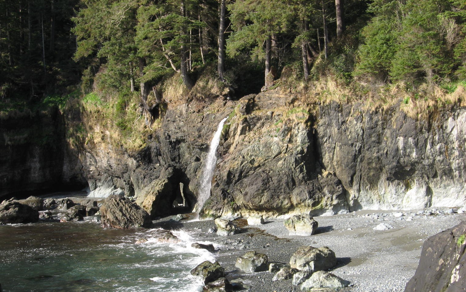
There is evidence of isostatic rebound along the southwest coast of Vancouver Island, where a number of streams enter the ocean as 5 m high waterfalls, as shown in Figure 17.4.2.
Tectonic sea-level changes are local changes caused by tectonic processes. The subduction of the Juan de Fuca Plate beneath British Columbia, Washington, Oregon and northern California is creating tectonic uplift (about 1 mm/year) along the western edge of the continent, although much of this uplift is likely to be reversed when the next large subduction-zone earthquake strikes.

Coastlines in areas where there has been net sea-level rise in the geologically recent past are commonly characterized by estuaries and fjords. Howe Sound, north of Vancouver, is an example of a fjord (Figure 17.4.3). This valley was filled with ice during the last glaciation, and there has been a net rise in sea level here since that time. Coastlines in areas where there has been net sea-level drop in the geologically recent past are characterized by uplifted wave-cut platforms (or stream valleys as shown in Figure 17.4.2). Uplifted beach lines are another product of relative sea-level drop, although these are difficult to recognize in areas with vigorous vegetation. They are relatively common in Canada’s far north.
Exercise 17.4 A holocene uplifted shore
The blue-grey sediments in the photo contain marine fossils of early Holocene age (~12,500 years ago) situated at about 60 m above sea level on Gabriola Island, BC. Explain how eustatic and isostatic sea-level change processes might have contributed to the existence of these materials at this elevation.

See Appendix 3 for Exercise 17.4 answers.
Media Attributions
- Figures 17.4.1, 17.4.3, 17.4.4: © Steven Earle. CC BY.
- Figure 17.4.2: "Post-Glacial Sea Level" © Robert A. Rohde. CC BY-SA.
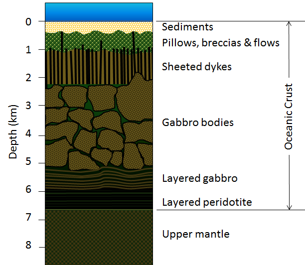
As we discussed in Chapter 10, oceanic crust is formed at sea-floor spreading ridges from magma generated by decompression melting of hot upward-moving mantle rock (Figure 10.4.3). About 10% of the mantle rock melts under these conditions, producing mafic magma. This magma oozes out onto the sea floor to form pillow basalts (Figure 18.0.1), breccias (fragmented basaltic rock), and flows, interbedded in some cases with limestone or chert. Beneath the volcanic rock are layers with gabbroic sheeted dykes (which sometimes extend up into the pillow layer), gabbroic stocks, and finally layered peridotite (ultramafic rock) at the base. The ultramafic rock of the mantle lies below that. Over time, the igneous rock of the oceanic crust gets covered with layers of sediment, which eventually become sedimentary rock, including limestone, mudstone, chert, and turbidites. The lithologies of the layers of the oceanic crust are shown in Figure 18.2.1.
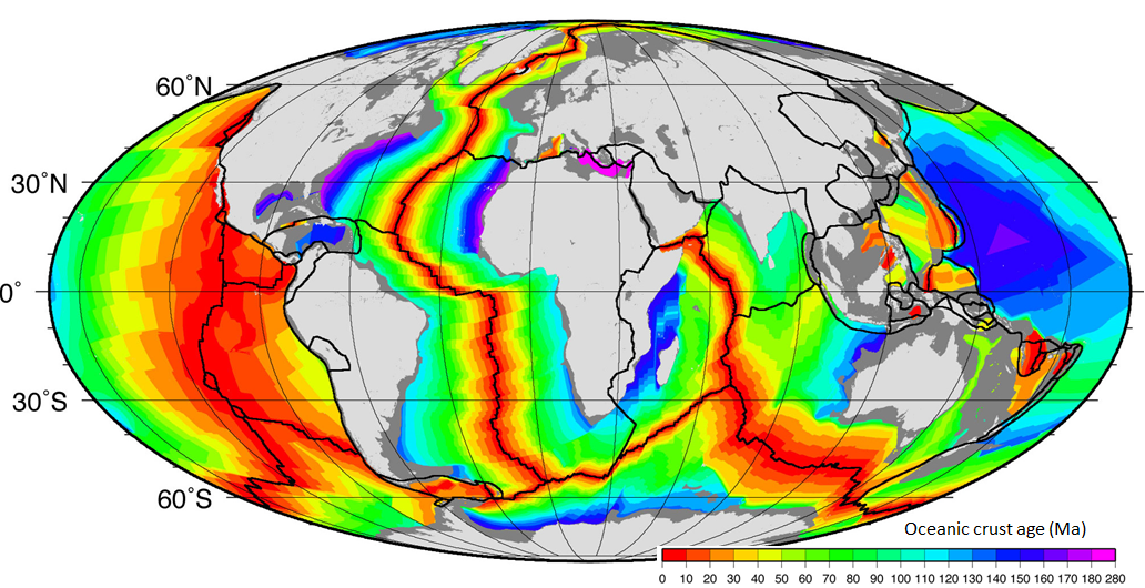
The age of the oceanic crust has been determined by systematic mapping variations in the strength of the Earth’s magnetic field across the sea floor and comparing the results with our understanding of the record of Earth’s magnetic field reversal chronology for the past few hundred million years. The ages of different parts of the crust are shown in Figure 18.2.2. The oldest oceanic crust is around 280 Ma in the eastern Mediterranean, and the oldest parts of the open ocean are around 180 Ma on either side of the north Atlantic. It may be surprising, considering that parts of the continental crust are close to 4,000 Ma old, that the oldest sea floor is less than 300 Ma. Of course, the reason for this is that all sea floor older than that has been either subducted or pushed up to become part of the continental crust. For example, there are fragments of sea floor in British Columbia that date back to around 380 and 220 Ma, and there are similar rocks in the Canadian Shield that are older than 3 Ga.
As one would expect, the oceanic crust is very young near the spreading ridges (Figure 18.2.2), and there are obvious differences in the rate of sea-floor spreading along different ridges. The ridges in the Pacific and southeastern Indian Oceans have wide age bands, indicating rapid spreading (approaching 10 centimetres per year (cm/y) on each side in some areas), while those in the Atlantic and western Indian Oceans are spreading much more slowly (less than 2 cm/y on each side in some areas).

This map shows the magnetic patterns on the Juan de Fuca plate. The coloured bands represent periods of normal magnetism, while the white bands represent reversed magnetism. A magnetic-reversal time scale is also shown.
- How old is the oldest part of the Juan de Fuca Plate that is subducting along the Cascadia subduction boundary?
- How old is the youngest part of the Juan de Fuca Plate that is subducting?
The magnetic patterns and chronology shown here have been colour-coded to make them easy to interpret, but on most such maps the magnetic patterns are shown only as black and white stripes, making it much more difficult to interpret the ages of the sea floor. Magnetic-reversal patterns that have no context (such as the 0 age along the spreading ridge in this case) are very difficult to interpret.
As is evident from Figures 18.1.1 and 18.1.2, the sea floor is dotted with chains of seamounts, isolated seamounts, and ocean islands. Almost all of these features are volcanoes, and most are much younger than the oceanic crust on which they formed. Some seamounts and ocean islands are formed above mantle plumes, the best example being Hawaii. The oldest of the Hawaiian/Emperor seamounts is dated at around 80 Ma; it is situated on oceanic crust aged around 90 to 100 Ma. The youngest of the Hawaiian lavas—at Kilauea Volcano on the island of Hawaii—is now more than a year old (last eruption was April 30th 2018). The island is surrounded by oceanic crust that is around 85 Ma old. All of the mantle-plume-derived volcanic islands are dominated by mafic rocks.
Many seamounts are related to subduction along ocean-ocean convergent boundaries. These include the Aleutians, extending from Alaska to Russia, and the Lesser Antilles in the eastern part of the Caribbean.
Some of the linear belts of volcanoes in the Pacific Ocean do not show age-distance relationships like the volcanoes of the Hawaii-Emperor chain or the Galapagos Islands. For example, the Line Islands, which spread out over more than 1,000 kilometres south of the Hawaiian chain, were all formed between 70 and 85 Ma and are interpreted to be related to rifting.
Most tropical islands have associated carbonate reefs, in some cases, as fringes right around the island, and in some cases, as barriers some distance away. In many cases, the reef is there, but the island that is assumed to have led to its formation is gone. The formation of fringing reefs, barrier reefs, and atolls is illustrated in Figure 18.2.4.

The key factor in this process is sea-level change, either because of post-glacial sea-level rise, or because of subsidence of a volcano — as it is moved away from a spreading ridge — or both. If the rate of sea-level change is slow enough (e.g., less than 1 cm/year), a reef can keep up and maintain its position at sea level long after its parent volcanic island has disappeared beneath the waves.
Image Descriptions
Figure 18.2.3 image description: The Juan de Fuca plate lies between the Pacific Plate and the North America Plate along the west coast of Vancouver Island and Washington State. The Juan de Fuca Plate is subducting under the North America Plate along the Cascadia subduction boundary. The Juan de Fuca Plate is youngest along the Juan de Fuca ridge at the Pacific Plate and is older as it moves east. The magnetic time scales shows periods of magnetic reversal, and the ages of the parts of the Juan de Fuca plate that are subducting range from just over 0 Ma in the northwest corner of the plate to over 8 Ma in the southeast corner of the plate. [Return to Figure 18.2.3]
Figure 18.2.4 image description: A volcanic island forms and a fringing reef develops around it in the water. It becomes a barrier reef as the volcanic island subsides and water is able to pool between the island and the reef to form a lagoon. An atoll is formed when the volcano subsides enough that it no longer breaches the ocean surface but the reef remains to form a pool. [Return to Figure 18.2.4]
Media Attributions
- Figures 18.2.1, 18.2.3, 18.2.4: © Steven Earle. CC BY.
- Figure 18.2.2: "Age of oceanic lithosphere" © National Oceanic and Atmospheric Administration. Adapted by Steven Earle. CC BY-SA.
Except within a few kilometres of a ridge crest, where the volcanic rock is still relatively young, most parts of the sea floor are covered in sediments. This material comes from several different sources and is highly variable in composition, depending on proximity to a continent, water depth, ocean currents, biological activity, and climate. Sea-floor sediments (and sedimentary rocks) can range in thickness from a few millimetres to several tens of kilometres. Near the surface, the sea-floor sediments remain unconsolidated, but at depths of hundreds to thousands of metres (depending on the type of sediment and other factors) the sediment becomes lithified.
The various sources of sea-floor sediment can be summarized as follows:
- Terrigenous sediment is derived from continental sources transported by rivers, wind, ocean currents, and glaciers. It is dominated by quartz, feldspar, clay minerals, iron oxides, and terrestrial organic matter.
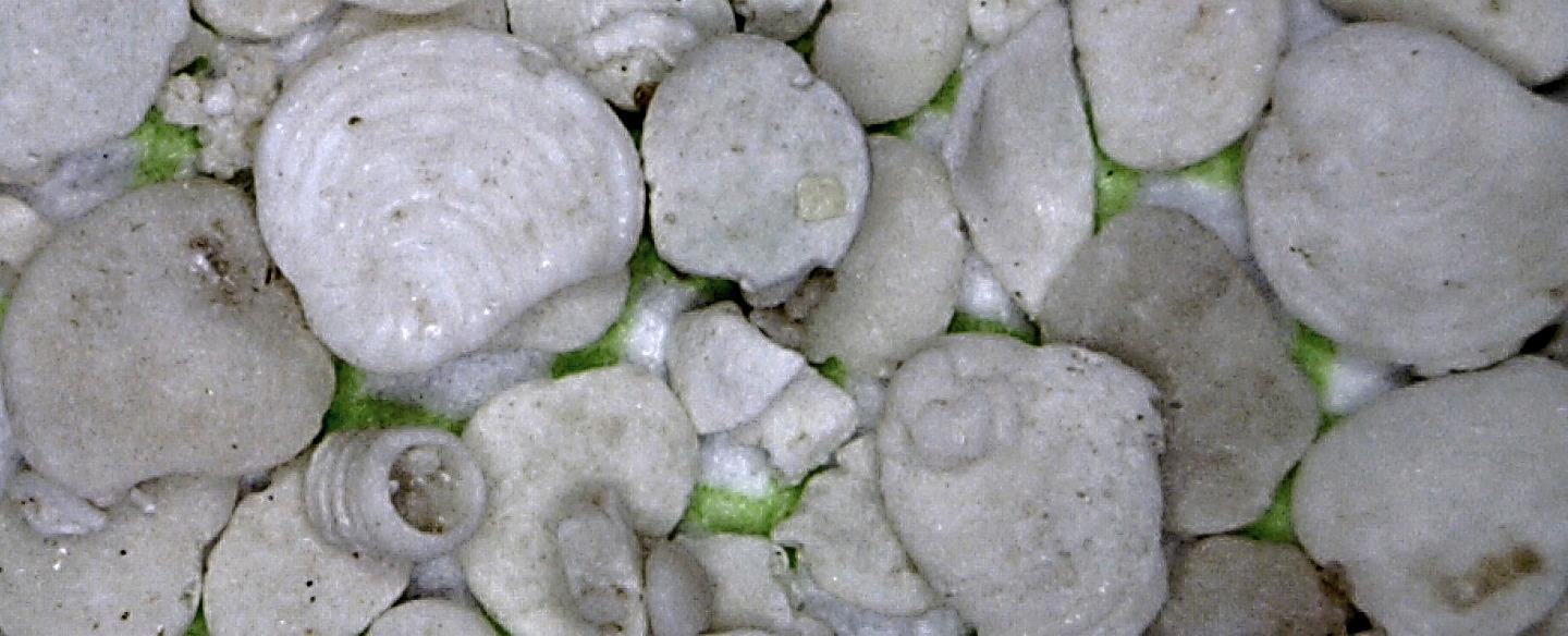
- Pelagic carbonate sediment is derived from organisms (e.g., foraminifera) living in the ocean water (at various depths, but mostly near surface) that make their shells (a.k.a. tests) out of carbonate minerals such as calcite.
- Pelagic silica sediment is derived from marine organisms (e.g., diatoms and radiolaria) that make their tests out of silica (microcrystalline quartz).
- Volcanic ash and other volcanic materials are derived from both terrestrial and submarine eruptions.
- Iron and manganese nodules form as direct precipitates from ocean-bottom water.
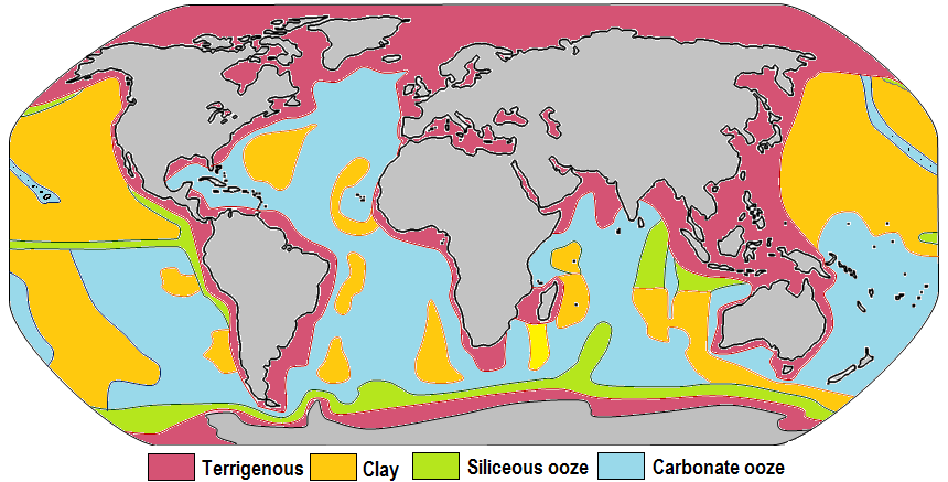
The distributions of some of these materials around the seas are shown in Figure 18.3.1. Terrigenous sediments predominate near the continents and within inland seas and large lakes. These sediments tend to be relatively coarse, typically containing sand and silt, but in some cases even pebbles and cobbles. Clay settles slowly in nearshore environments, but much of the clay is dispersed far from its source areas by ocean currents. Clay minerals are predominant over wide areas in the deepest parts of the ocean, and most of this clay is terrestrial in origin. Siliceous oozes (derived from radiolaria and diatoms) are common in the south polar region, along the equator in the Pacific, south of the Aleutian Islands, and within large parts of the Indian Ocean. Carbonate oozes are widely distributed in all of the oceans within equatorial and mid-latitude regions. In fact, clay settles everywhere in the oceans, but in areas where silica- and carbonate-producing organisms are prolific, they produce enough silica or carbonate sediment to dominate over clay.
Carbonate sediments are derived from a wide range of near-surface pelagic organisms that make their shells out of carbonate (Figure 18.3.2). These tiny shells, and the even tinier fragments that form when they break into pieces, settle slowly through the water column, but they don’t necessarily make it to the bottom. While calcite is insoluble in surface water, its solubility increases with depth (and pressure) and at around 4,000 metres, the carbonate fragments dissolve. This depth, which varies with latitude and water temperature, is known as the carbonate compensation depth, or CCD. As a result, carbonate oozes are absent from the deepest parts of the ocean (deeper than 4,000 metres), but they are common in shallower areas such as the mid-Atlantic ridge, the East Pacific Rise (west of South America), along the trend of the Hawaiian/Emperor Seamounts (in the northern Pacific), and on the tops of many isolated seamounts.
Exercise 18.3 What type of sediment?
The diagram shows the sea floor in an area where there is abundant pelagic carbonate sediment. There is a continent within 100 kilometres of this area, to the right. What type of sediment (coarse terrigenous, clay, siliceous ooze, or carbonate ooze) would you expect at find at locations a, b, c, and d?

See Appendix 3 for Exercise 18.3 answers.
All terrestrial erosion products include a small proportion of organic matter derived mostly from terrestrial plants. Tiny fragments of this material plus other organic matter from marine plants and animals accumulate in terrigenous sediments, especially within a few hundred kilometres of shore. As the sediments pile up, the deeper parts start to warm up (from geothermal heat), and bacteria get to work breaking down the contained organic matter. Because this is happening in the absence of oxygen (a.k.a. anaerobic conditions), the by-product of this metabolism is the gas methane (CH4). Methane released by the bacteria slowly bubbles upward through the sediment toward the sea floor.
At water depths of 500 metres to 1,000 metres, and at the low temperatures typical of the sea floor (close to 4°C), water and methane combine to create a substance known as methane hydrate. Within a few metres to hundreds of metres of the sea floor, the temperature is low enough for methane hydrate to be stable and hydrates accumulate within the sediment (Figure 18.3.4). Methane hydrate is flammable because when it is heated, the methane is released as a gas (Figure 18.3.4). The methane within sea-floor sediments represents an enormous reservoir of fossil fuel energy. Although energy corporations and governments are anxious to develop ways to produce and sell this methane, anyone that understands the climate-change implications of its extraction and use can see that this would be folly. As we’ll see in the discussion of climate change in Chapter 19, sea-floor methane hydrates have had significant impacts on the climate in the distant past.

Image Descriptions
Figure 18.3.3 image description: A. is farthest from the continent. D is closest to the continent.
- A depth of 4.5 kilometres.
- A depth of 3.5 kilometres.
- A depth of 5 kilometres.
- A depth of 1 kilometre, close to the edge of a continent.
Media Attributions
- Figure 18.3.1, 18.3.2, 18.3.3: © Steven Earle. CC BY.
- Figure 18.3.4 (Left): "Gashydrat im Sediment" © Wusel007. CC BY-SA.
- Figure 18.3.4 (Right): "Burning Gas Hydrates" by J. Pinkston and L. Stern (USGS). Public domain.
As everyone knows, seawater is salty. It is that way because the river water that flows into the oceans contains small amounts of dissolved ions, and for the most part, the water that comes out of the oceans is the pure water that evaporates from the surface. Billions of years of a small amount of salt going into the ocean—and none coming out (most of the time)—has made the water salty. The salts of the ocean (dominated by sodium, chlorine, and sulphur) (Figure 18.4.1) are there because they are very soluble and they aren’t consumed by biological processes (most of the calcium, for example, is used by organisms to make carbonate minerals). If salts are always going into the ocean, and never coming out, one might assume that the oceans have been continuously getting saltier over geological time. In fact this appears not to be the case. There is geological evidence that Earth’s oceans became salty early during the Archaean, and that at times in the past, they have been at least half again as salty as they are now. This implies that there must be a mechanism to remove salt from the oceans, and that mechanism is the isolation of some parts of the ocean into seas (such as the Mediterranean) and the eventual evaporation of those seas to create salt beds that become part of the crust. The Middle Devonian Prairie Evaporite Formation of Saskatchewan and Manitoba is a good example of this.

The average salinity of the oceans is 35 g of salt per litre of water, but there are significant regional variations in this value, as shown in Figure 18.4.2. Ocean water is least salty (around 31 g/L) in the Arctic, and also in several places where large rivers flow in (e.g., the Ganges/Brahmaputra and Mekong Rivers in southeast Asia, and the Yellow and Yangtze Rivers in China). Ocean water is most salty (over 37 g/L) in some restricted seas in hot dry regions, such as the Mediterranean and Red Seas. You might be surprised to know that, in spite of some massive rivers flowing into it (such as the Nile and the Danube), water does not flow out of the Mediterranean Sea into the Atlantic. There is so much evaporation happening in the Mediterranean basin that water flows into it from the Atlantic, through the Strait of Gibraltar.
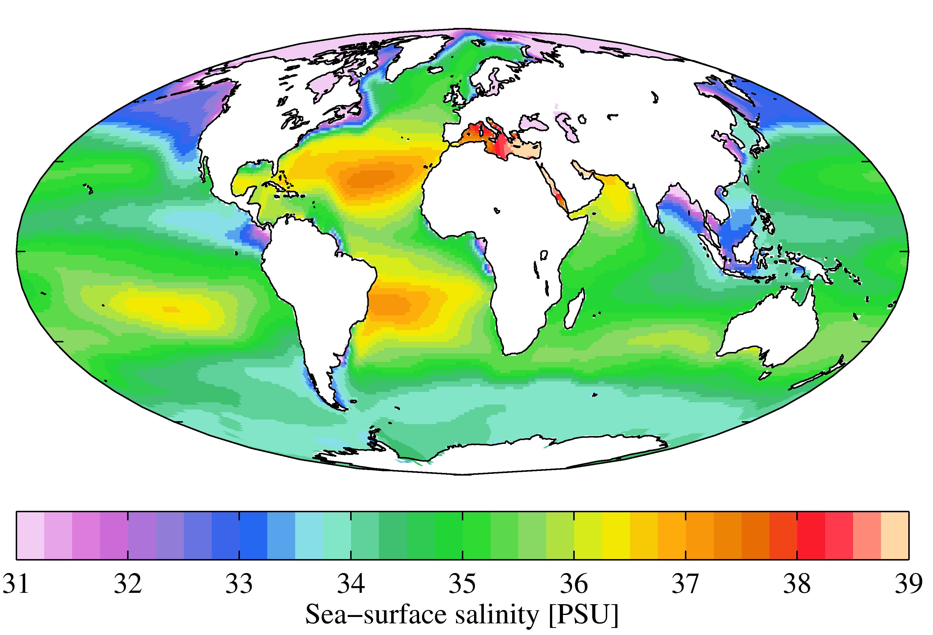
In the open ocean, salinities are elevated at lower latitudes because this is where most evaporation takes place. The highest salinities are in the subtropical parts of the Atlantic, especially north of the equator. The northern Atlantic is much more saline than the north Pacific because the Gulf Stream current brings a massive amount of salty water from the tropical Atlantic and the Caribbean to the region around Britain, Iceland, and Scandinavia. The salinity in the Norwegian Sea (between Norway and Iceland) is substantially higher than that in other polar areas.
Exercise 18.4 Salt chunk
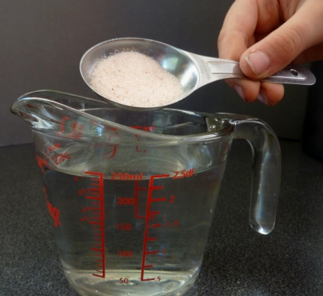
How salty is the sea? If you’ve ever had a swim in the ocean, you’ve probably tasted it. To understand how salty the sea is, start with 250 mL of water (1 cup). There is 35 g of salt in 1 L of seawater so in 250 mL (1/4 litre) there is 35/4 = 8.75 or ~9 g of salt. This is just short of 2 teaspoons, so it would be close enough to add 2 level teaspoons of salt to the cup of water. Then stir until it’s dissolved. Have a taste!
Of course, if you used normal refined table salt, then what you added was almost pure NaCl. To get the real taste of seawater you would want to use some evaporated seawater salt (a.k.a. sea salt), which has a few percent of magnesium, sulphur, and calcium plus some trace elements.
See Appendix 3 for Exercise 18.4 answers.
Not unexpectedly, the oceans are warmest near the equator—typically 25° to 30°C—and coldest near the poles—around 0°C (Figure 18.4.4). (Sea water will remain unfrozen down to about -2°C.) At southern Canadian latitudes, average annual water temperatures are in the 10° to 15°C range on the west coast and in the 5° to 10°C range on the east coast. Variations in sea-surface temperatures (SST) are related to redistribution of water by ocean currents, as we’ll see below. A good example of that is the plume of warm Gulf Stream water that extends across the northern Atlantic. St. John’s, Newfoundland, and Brittany in France are at about the same latitude (47.5° N), but the average SST in St. John’s is a frigid 3°C, while that in Brittany is a reasonably comfortable 15°C.

Currents in the open ocean are created by wind moving across the water and by density differences related to temperature and salinity. An overview of the main ocean currents is shown in Figure 18.4.5. As you can see, the northern hemisphere currents form circular patterns (gyres) that rotate clockwise, while the southern hemisphere gyres are counter-clockwise. This happens for the same reason that the water in your northern hemisphere sink rotates in a clockwise direction as it flows down the drain; this is caused by the Coriolis effect.
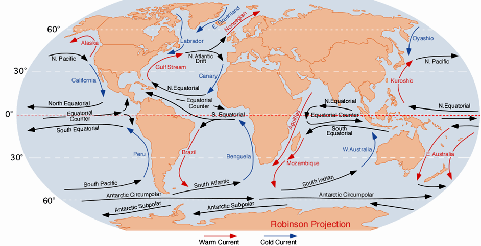
Because the ocean basins aren’t like bathroom basins, not all ocean currents behave the way we would expect. In the North Pacific, for example, the main current flows clockwise, but there is a secondary current in the area adjacent to our coast—the Alaska Current—that flows counter-clockwise, bringing relatively warm water from California, past Oregon, Washington, and B.C. to Alaska. On Canada’s eastern coast, the cold Labrador Current flows south past Newfoundland, bringing a stream of icebergs past the harbour at St. John’s (Figure 18.4.7). This current helps to deflect the Gulf Stream toward the northeast, ensuring that Newfoundland stays cool, and western Europe stays warm.

Exercise 18.5: Understanding the Coriolis effect
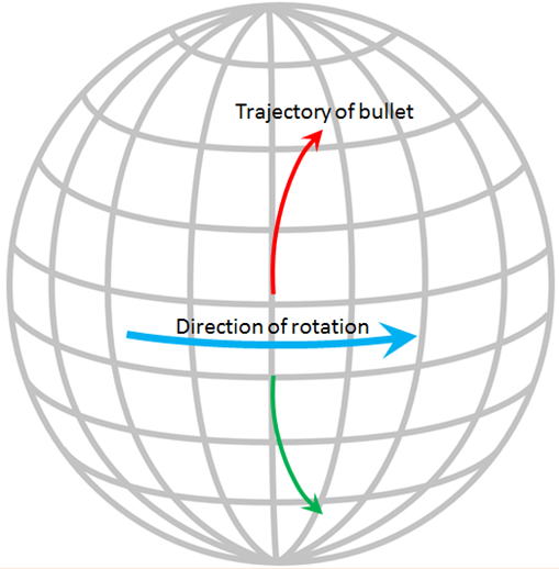
The Coriolis effect has to do with objects that are moving in relation to other objects that are rotating. An ocean current is moving across the rotating Earth, and its motion is controlled by the Coriolis effect.
Imagine that you are standing on the equator looking straight north and you fire a gun in that direction. The bullet in the gun starts out going straight north, but it also has a component of motion toward the east that it gets from Earth’s rotation, which is 1,670 kilometres per hour at the equator. Because of the spherical shape of Earth, the speed of rotation away from the equator is not as fast as it is at the equator (in fact, the Earth’s rotational speed is 0 kilometres per hour at the poles) so the bullet actually traces a clockwise curved path across Earth’s surface, as shown by the red arrow on the diagram. In the southern hemisphere the Coriolis effect is counterclockwise (green arrow).
The Coriolis effect is imparted to the rotations of ocean currents and tropical storms. If Earth were a rotating cylinder, instead of a sphere, there would be no Coriolis effect.
See Appendix 3 for Exercise 18.5 answers.
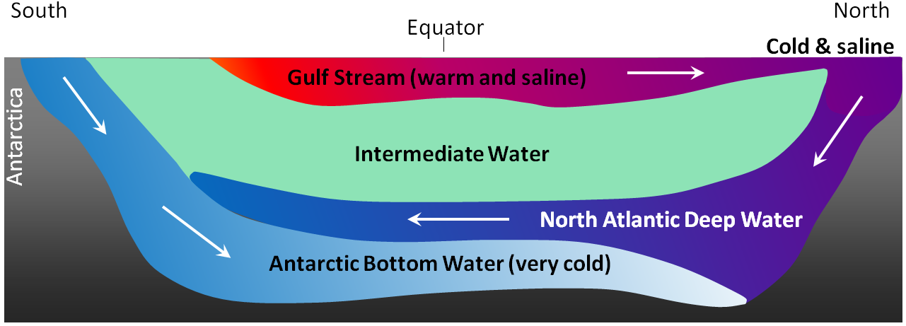
The currents shown in Figure 18.4.5 are all surface currents, and they only involve the upper few hundred metres of the oceans. But there is much more going on underneath. The Gulf Stream, for example, which is warm and saline, flows past Britain and Iceland into the Norwegian Sea (where it becomes the Norwegian Current). As it cools down, it becomes denser, and because of its high salinity, which also contributes to its density, it starts to sink beneath the surrounding water (Figure 18.4.8). At this point, it is known as North Atlantic Deep Water (NADW), and it flows to significant depth in the Atlantic as it heads back south. Meanwhile, at the southern extreme of the Atlantic, very cold water adjacent to Antarctica also sinks to the bottom to become Antarctic Bottom Water (AABW) which flows to the north, underneath the NADW.
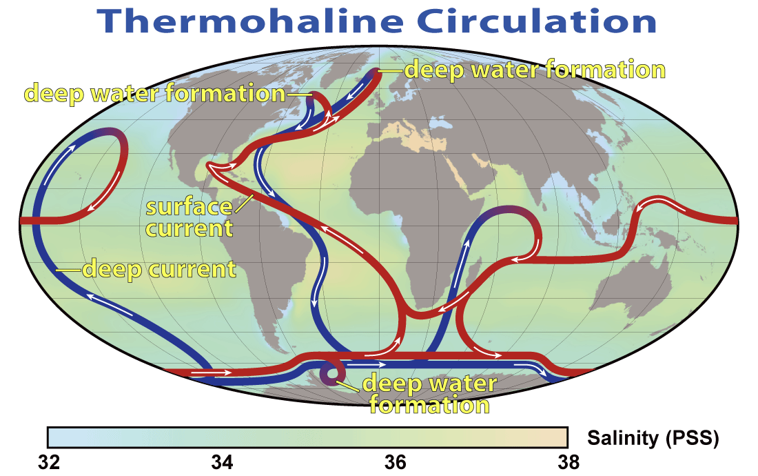
The descent of the dense NADW is just one part of a global system of seawater circulation, both at surface and at depth, as illustrated in Figure 18.4.9. The water that sinks in the areas of deep water formation in the Norwegian Sea and adjacent to Antarctica moves very slowly at depth. It eventually resurfaces in the Indian Ocean between Africa and India, and in the Pacific Ocean, north of the equator.
The thermohaline circulation is critically important to the transfer of heat on Earth. It brings warm water from the tropics to the poles, and cold water from the poles to the tropics, thus keeping polar regions from getting too cold and tropical regions from getting too hot. A reduction in the rate of thermohaline circulation would lead to colder conditions and enhanced formation of sea ice at the poles. This would start a positive feedback process that could result in significant global cooling. There is compelling evidence to indicate that there were major changes in thermohaline circulation, corresponding with climate changes, during the Pleistocene Glaciation.
Image Descriptions
Figure 18.4.5 image description: The currents of the world's oceans work together to form a number of general patterns. Currents flow into each other to form larger currents. Groups of currents in the northern hemisphere flow clockwise. This includes groups of currents in the North Pacific Ocean and the North Atlantic Ocean. Currents in the southern hemisphere flow counter-clockwise. This includes groups of currents in the South Pacific Ocean, the South Atlantic Ocean, and the Indian Ocean. Currents flowing towards the equator are colder than the surrounding water. Currents flowing away from the equator are warmer than the surrounding water. Currents below 60° South flow from east to west (or west to east) around Antarctica. Currents along the Equator also flows east to west (or west to east). Currents flowing from east to west (or west to east) are the same temperature as the surrounding water. For a more detailed description of specific currents, refer to the following table, which describes 26 major currents, including their location, direction of flow, and relationship to surrounding currents. They are arranged in alphabetical order. Or, you can [Return to Figure 18.4.5].
| Name of Current | Temperature of current compared to the surrounding water | Direction of flow | Relationship to nearby currents |
|---|---|---|---|
| Agulhas | A warm current | The Agulhas current flows south from the Arabian peninsula down the east coast of Africa. | The Agulhas current joins with the Mozambique current, which also flows south. |
| Alaska | A warm current | The Alaska current flows north up the west coast of the United States and Canada before circling to the west once it reaches Alaska | The Alaska current flows into the Oyashio current |
| Antarctic Circumpolar | No temperature difference | The Antarctic Circumpolar current flows east to circle around Antarctica. | The Antarctic Circumpolar flows east above the Antarctic Subpolar, which flows west. |
| Antarctic Subpolar | No temperature difference | The Antarctic Subpolar current flows west along the coast of Antarctica. | The Antarctic Subpolar current flows west below the Antarctic Circumpolar current, which flows east. |
| Benguela | A cold current | The Benguela current flows north along the south west coast of Africa. | The Benguela current flows into the South Equatorial current and is fed by the South Atlantic current. |
| Brazil | A warm current | The Brazil current flows south along the east coast of South America. | The Brazil current flows into the South Atlantic current and is fed by the south branch of the South Equatorial current. |
| California | A cold current | The California current flows south from the southwest coast of the United States down along the west coast of Mexico. | The California current flows into the North Equatorial current and is fed by the North Pacific current. |
| Canary | A cold current | The Canary current flows from south along the north west coast of Africa from Morocco to Sengal. | The Canary current flows into the North Equatorial current and is fed by the North Atlantic Drift. |
| East Australian | A warm current | The East Australian currents flow from the equator and south, past the east coast of Australia. One flows between New Zealand and Australia, and the other flows past the east side of New Zealand. | The East Australian currents flow into the South Pacific current and they are fed by the South Equatorial current. |
| East Greenland | A cold current | The East Greenland current flows south along the east coast of Greenland. | The East Greenland current flows into the Labrador current. |
| Equatorial Counter | No temperature difference. | The Equatorial Counter current flows east along the equator. It is broken up into three sections: One in the Pacific Ocean, one in the Atlantic Ocean, and one in the Indian Ocean. | The Equatorial Counter current flows east between the North Equatorial and the South Equatorial currents, which both flow west. |
| Gulf Stream | A warm current | The Gulf Stream flows north from the Caribbean along the east coast of the United States. | The Gulf Stream flows into the North Atlantic Drift current and is fed by the North Equatorial current. |
| Kuroshio | A warm current | The Kuroshio current flows north along the east coast of the Philippines and Japan. | The Kuroshio current flows into the North Pacific current and is fed by the North Equatorial current. |
| Labrador | A cold current | The Labrador current flows south along the eastern coast of Canada to the northern United States. | The Labrador current is partially fed by the East Greenland current. Once it reaches the northern United States, it flows past the Gulf Stream. |
| Mozambique | A warm current | The Mozambique current flows south along the east coast of Madagascar and into the Southern Ocean. | The Mozambique current flows into the South Indian current and is fed by the South Equatorial current. |
| North Atlantic Drift | No temperature difference | The North Atlantic Drift current flows east across the Atlantic Ocean from the north coast of the United States to the south coast of Spain. | The North Atlantic Drift current splits to flow north into the Norwegian current and to flow south into the Canary current. It is fed by the Gulf Stream. |
| North Equatorial | No temperature difference. | The North Equatorial current flows west just above the equator. It is broken up into three sections: One in the Pacific Ocean, one in the Atlantic Ocean, and one in the Indian Ocean. | The North Equatorial current in the Pacific Ocean flows into the Kuroshio current and is fed by the California current. The North Equatorial current in the Atlantic Ocean flows into the Gulf Stream and is fed by the Canary current. The North Equatorial current in the Indian Ocean turns at Africa to join the Equatorial Counter current. |
| North Pacific | No temperature difference | The North Pacific current flows west across the Pacific Ocean from Japan to the south coast of the United States. | The North Pacific current flows into the California current and is fed by the Kuroshio current. |
| Norwegian | A warm current | The Norwegian current flows north from the north coast of the United Kingdom to along the coast of Norway. | This current is fed by the northern branch of the North Atlantic Drift current and flows into the Arctic Ocean. |
| Oyashio | A cold current | The Oyashio current flows south along the east coast of Russia. | The Oyashio current clashes with the Kuroshio current, which flows north into the North Pacific current. |
| Peru | A cold current | The Peru current flows north along the central west coast of South America. | The Peru current flows into the South Equatorial current and is fed by the South Pacific current. |
| South Atlantic | No temperature difference | The South Atlantic current flows from the south tip of South America to towards the south tip of Africa. | The South Atlantic current flows into the Benguela current and is fed by the Brazil current. |
| South Equatorial | No temperature difference | The South Equatorial current flows west just below the equator. It is broken up into three sections: One in the Pacific Ocean, one in the Atlantic Ocean, and one in the Indian Ocean. | The South Equatorial current in the Pacific Ocean flows into the East Australian currents and is fed by the Peru current. The South Equatorial current in the Atlantic Ocean flows north and south: North along the north east coast of South America and south into the Brazil current. It is fed by the Benguela current. The South Equatorial current in the Indian Ocean flows into the Mozambique current and is fed by the West Australian current. |
| South Indian | No temperature difference | The South Indian current flows from the southern part of the Indian ocean towards the south west coast of Australia. | The South Indian current flows into the West Australian current and is fed by the Mozambique current. |
| South Pacific | No temperature difference | The South Pacific current flows east from the south east coast of Australia to the south west coast of South America. | The South Pacific current flows into the Peru current and is fed by the East Australian current. |
| West Australian current | A cold current | The West Australian current flows north along the west coast of Australia. | The West Australian current flows into the South Equatorial current and is fed by the South Indian current. |
Media Attributions
- Figure 18.4.1: © Steven Earle. CC BY.
- Figure 18.4.2: "WOA09 sea-surf SAL AYool" © Plumbago. CC BY-SA.
- Figure 18.4.3: © Steven Earle. CC BY.
- Figure 18.4.4: "WOA09 sea-surf TMP AYool" © Plumbago. CC BY-SA.
- Figure 18.4.5: "Corrientes Oceanicas" by Dr. Michael Pidwirny. Public domain.
- Figure 18.4.6: "Newfoundland Iceberg just off Exploits Island" © Shawn. CC BY-SA.
- Figures 18.4.7, 18.4.7: © Steven Earle. CC BY.
- Figure 18.4.9: "Thermohaline Circulation" by NASA. Public domain.
There are two parts to climate change, the first one is known as climate forcing, which is when conditions change to give the climate a little nudge in one direction or the other. The second part of climate change, and the one that typically does most of the work, is what we call a feedback. When a climate forcing changes the climate a little, a whole series of environmental changes take place, many of which either exaggerate the initial change (positive feedbacks), or suppress the change (negative feedbacks).
An example of a climate-forcing mechanism is the increase in the amount of carbon dioxide (CO2) in the atmosphere that results from our use of fossil fuels. CO2 traps heat in the atmosphere and leads to climate warming. Warming changes vegetation patterns; contributes to the melting of snow, ice, and permafrost; causes sea level to rise; reduces the solubility of CO2 in sea water; and has a number of other minor effects. Most of these changes contribute to more warming. Melting of permafrost, for example, is a strong positive feedback because frozen soil contains trapped organic matter that is converted to CO2 and methane (CH4) when the soil thaws. Both these gases accumulate in the atmosphere and add to the warming effect. On the other hand, if warming causes more vegetation growth, that vegetation should absorb CO2, thus reducing the warming effect, which would be a negative feedback. Under our current conditions—a planet that still has lots of glacial ice and permafrost—most of the feedbacks that result from a warming climate are positive feedbacks and so the climate changes that we cause get naturally amplified by natural processes.
What is a greenhouse gas?
Throughout this chapter we’ll be talking about the role of greenhouse gases (GHGs) in controlling the climate, so it’s important to understand what greenhouse gases are and how they work. As you know, the dominant gases of the atmosphere are nitrogen (as N2) and oxygen (as O2). These gas molecules have only two atoms each and are not GHGs. Some of the other important gases of the atmosphere are water vapour (H2O), carbon dioxide (CO2), and methane (CH4). All of these have more than two atoms, and they are GHGs.

All molecules vibrate at various frequencies and in various ways, and some of those vibrations take place at frequencies within the range of the infrared (IR) radiation that is emitted by Earth’s surface. Gases with two atoms, such as O2, can only vibrate by stretching (back and forth), and those vibrations are much faster than the IR radiation (Figure 19.1.1). Gases with three or more atoms (such as CO2) vibrate by stretching as well, but they can also vibrate in other ways, such as by bending. Those vibrations are slower and match IR radiation frequencies.
When IR radiation interacts with CO2 or with one of the other GHGs, the molecular vibrations are enhanced because there is a match between the wavelength of the IR light and the vibrational frequency of the molecule. This makes the molecule vibrate more vigorously, heating the surrounding air in the process. These molecules also emit IR radiation in all directions, some of which reaches Earth’s surface. The heating caused by the more vigorous vibrations of GHGs is the greenhouse effect.
Natural Climate Forcing
Natural climate forcing has been going on throughout geological time. A wide range of processes has been operating at widely different time scales, from a few years to billions of years.
The longest-term natural forcing variation is related to the evolution of the Sun. Like most other stars of a similar mass, our Sun is evolving. For the past 4.57 billion years, its rate of nuclear fusion has been increasing, and it is now emitting about 40% more energy (as light) than it did at the beginning of geological time (Figure 19.1.2). A difference of 40% is big, so it’s a little surprising that the temperature on Earth has remained at a reasonable and habitable temperature for all of this time. The mechanism for that relative climate stability has been the evolution of our atmosphere from one that was dominated by CO2, and also had significant levels of CH4—both GHGs—to one with only a few hundred parts per million of CO2 and just under 1 part per million of CH4. Those changes to our atmosphere have been no accident; over geological time, life and its metabolic processes have evolved and changed the atmosphere to conditions that remained cool enough to be habitable. A scientific explanation for how this could happen is known as the Gaia hypothesis.

The Gaia hypothesis

The Gaia hypothesis, developed by British scientist and environmentalist James Lovelock in the 1960s, is the theory that organisms evolve in ways that contribute to ensuring that their environment remains habitable. It does not include any sort of coordination of effort among organisms or any consciousness of a need to make changes. Gaia is not a superorganism. A way of understanding Gaia is through Lovelock’s simple Daisyworld model. A planet with a warming star is populated only by two types of daisies, white ones and black ones (Figure 19.1.3). The black ones contribute to warming because they absorb solar energy, while the white ones reflect light and contribute to cooling. As the star’s luminosity gradually increases, the white daisies have better outcomes because their reflectivity cools their local environment, while the black daisies, suffering from the heat, do not reproduce as well. Over time white daisies gradually dominate the population, but eventually the star becomes so bright that even white daisies cannot compensate, and all of the daisies perish. Obviously Earth is not Daisyworld, but similar processes—such as the evolution of photosynthetic bacteria that consume CO2—have taken place that influence the atmosphere and moderate the climate.
Plate tectonic processes contribute to climate forcing in several different ways, and on time scales ranging from tens of millions to hundreds of millions of years. One mechanism is related to continental position. For example, we know that Gondwana (South America + Africa + Antarctica + Australia) was positioned over the South Pole between about 450 and 250 Ma, during which time there were two major glaciations (Andean-Saharan and Karoo) affecting the South polar regions (Figure 16.1.1) and cooling the rest of the planet at the same time. Another mechanism is related to continental collisions. As described in Chapter 16, the collision between India and Asia, which started at around 50 Ma, resulted in massive tectonic uplift. The consequent accelerated weathering of this rugged terrain consumed CO2 from the atmosphere and contributed to gradual cooling over the remainder of the Cenozoic. Also, as described in Chapter 16, the opening of the Drake Passage — due to plate-tectonic separation of South America from Antarctica — led to the development of the Antarctic Circumpolar Current, which isolated Antarctica from the warmer water in the rest of the ocean and thus contributed to Antarctic glaciation starting at around 35 Ma.
As we discussed in Chapter 4, volcanic eruptions don’t just involve lava flows and exploding rock fragments; various particulates and gases are also released, the important ones being sulphur dioxide and CO2. Sulphur dioxide is an aerosol that reflects incoming solar radiation and has a net cooling effect that is short lived (a few years in most cases, as the particulates settle out of the atmosphere within a couple of years), and doesn’t typically contribute to longer-term climate change. Volcanic CO2 emissions can contribute to climate warming but only if a greater-than-average level of volcanism is sustained over a long time (at least tens of thousands of years). It is widely believed that the catastrophic end-Permian extinction (at 250 Ma) resulted from warming initiated by the eruption of the massive Siberian Traps over a period of at least a million years.
Exercise 19.1 Climate change at the K-Pg boundary
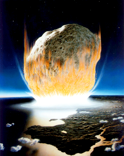
The large extraterrestrial impact at the end of the Cretaceous (Cretaceous-Paleogene or K-Pg boundary, a.k.a. K-T boundary) is thought to have produced a massive amount of dust, which may have remained in the atmosphere for several years, and also a great deal of CO2. What do you think would have been the short-term and longer-term climate-forcing implications of these two factors?
See Appendix 3 for Exercise 19.1 answers.
Earth’s orbit around the Sun is nearly circular, but like all physical systems, it has natural oscillations. First, the shape of the orbit changes on a regular time scale — close to 100,000 years — from being close to circular to being very slightly elliptical. But the circularity of the orbit is not what matters; it is the fact that as the orbit becomes more elliptical, the position of the Sun within that ellipse becomes less central or more eccentric (Figure 19.1.5a). Eccentricity is important because when it is high, the Earth-Sun distance varies more from season to season than it does when eccentricity is low.
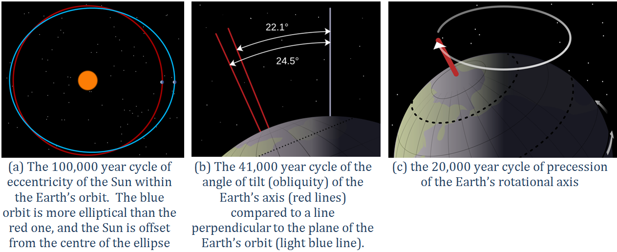
Second, Earth rotates around an axis through the North and South Poles, and that axis is at an angle to the plane of Earth’s orbit around the Sun (Figure 19.1.5b). The angle of tilt (also known as obliquity) varies on a time scale of 41,000 years. When the angle is at its maximum (24.5°), Earth’s seasonal differences are accentuated. When the angle is at its minimum (22.1°), seasonal differences are minimized. The current hypothesis is that glaciation is favoured at low seasonal differences as summers would be cooler and snow would be less likely to melt and more likely to accumulate from year to year.
Third, the direction in which Earth’s rotational axis points also varies, on a time scale of about 20,000 years (Figure 19.1.5c). This variation, known as precession, means that although the North Pole is presently pointing to the star Polaris (the pole star), in 10,000 years it will point to the star Vega.
The importance of eccentricity, tilt, and precession to Earth’s climate cycles (now known as Milankovitch Cycles) was first pointed out by Yugoslavian engineer and mathematician Milutin Milankovitch in the early 1900s. Milankovitch recognized that although the variations in the orbital cycles did not affect the total amount of insolation (light energy from the Sun) that Earth received, it did affect where on Earth that energy was strongest. Glaciations are most sensitive to the insolation received at latitudes of around 65°, and with the current configuration of continents, it would have to be 65° north (because there is almost no land at 65° south).
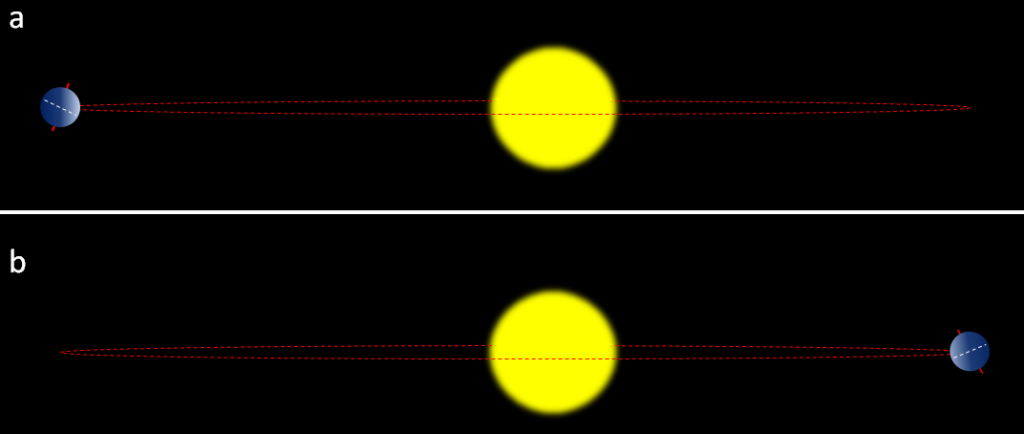
The most important aspects are whether the northern hemisphere is pointing toward the Sun at its closest or farthest approach, and how eccentric the Sun’s position is in Earth’s orbit. Two opposing situations are illustrated in Figure 19.1.6. In the upper panel, the northern hemisphere is at it farthest distance from the Sun during summer, which means cooler summers. In the lower panel, the northern hemisphere is at its closest distance to the Sun during summer, which means hotter summers. Cool summers—as opposed to cold winters—are the key factor in the accumulation of glacial ice, so the upper scenario in Figure 19.1.6 is the one that promotes glaciation. This factor is greatest when eccentricity is high.
Data for tilt, eccentricity, and precession over the past 400,000 years have been used to determine the insolation levels at 65° north, as shown in Figure 19.1.7. Also shown in Figure 19.1.7 are Antarctic ice-core temperatures from the same time period. The correlation between the two is clear, and it shows up in the Antarctic record because when insolation changes lead to growth of glaciers in the northern hemisphere, southern-hemisphere temperatures are also affected.

Ocean currents are important to climate, and currents also have a tendency to oscillate. Glacial ice cores show clear evidence of changes in the Gulf Stream (and other parts of the thermohaline circulation system) that affected global climate on a time scale of about 1,500 years during the last glaciation. The east-west changes in sea-surface temperature and surface pressure in the equatorial Pacific Ocean—known as the El Niño Southern Oscillation or ENSO—varies on a much shorter time scale of between two and seven years. These variations tend to garner the attention of the public because they have significant climate implications in many parts of the world. The past 65 years of ENSO index values are shown in Figure 19.1.8. The strongest El Niños in recent decades were in 1983 and 1998, and those were both very warm years from a global perspective. During a strong El Niño, the equatorial Pacific sea-surface temperatures are warmer than normal and heat the atmosphere above the ocean, which leads to warmer-than-average global temperatures.

Climate Feedbacks
As already stated, climate feedbacks are critically important in amplifying weak climate forcings into full-blown climate changes. When Milankovitch published his theory in 1924, it was widely ignored, partly because it was evident to climate scientists that the forcing produced by the orbital variations was not strong enough to drive the significant climate changes of the glacial cycles. Those scientists did not recognize the power of positive feedbacks. It wasn’t until 1973, 15 years after Milankovitch’s death, that sufficiently high-resolution data were available to show that the Pleistocene glaciations were indeed driven by the orbital cycles, and it became evident that the orbital cycles were just the forcing that initiated a range of feedback mechanisms that made the climate change.
Since Earth still has a very large volume of ice — mostly in the continental ice sheets of Antarctica and Greenland, but also in alpine glaciers and permafrost — melting is one of the key feedback mechanisms. Melting of ice and snow leads to several different types of feedbacks, an important one being a change in albedo. Albedo is a measure of the reflectivity of a surface. Earth’s various surfaces have widely differing albedos, expressed as the percentage of light that reflects off a given material. This is important because most solar energy that hits a very reflective surface is not absorbed and therefore does little to warm Earth. Water in the oceans or on a lake is one of the darkest surfaces, reflecting less than 10% of the incident light, while clouds and snow or ice are among the brightest surfaces, reflecting 70% to 90% of the incident light (Figure 19.1.9).

Exercise 19.2 Albedo implications of forest harvesting

When a forest is harvested, there are significant changes to the rate of biological uptake of CO2, but there is also a change in albedo. Using Figure 19.1.9, and assuming that a clear-cut has an albedo similar to sand, what is the albedo-only implication of clear-cutting for climate change? Be aware that this implication applies only to the albedo change caused by clear-cutting. Clear-cutting reduces the capacity of the area to absorb CO2, and also has numerous negative ecological and geological implications.
See Appendix 3 for Exercise 19.2 answers.
When sea ice melts, as it has done in the Arctic Ocean at a disturbing rate over the past decade, the albedo of the area affected changes dramatically, from around 80% down to less than 10%. This is a positive feedback because much more solar energy is absorbed by the water than by the pre-existing ice, and the temperature increase is amplified. The same applies to ice and snow on land, but the difference in albedo is not as great.
When ice and snow on land melt, sea level rises. (Sea level is also rising because the oceans are warming and that increases their volume.) A higher sea level means a larger proportion of the planet is covered with water, and since water has a lower albedo than land, more heat is absorbed and the temperature goes up a little more. Since the last glaciation, sea-level rise has been about 125 m; a huge area that used to be land is now flooded by heat-absorbent seawater. During the current period of anthropogenic climate change, sea level has risen only about 20 cm, and although that doesn’t make a big change to albedo, sea-level rise is accelerating.
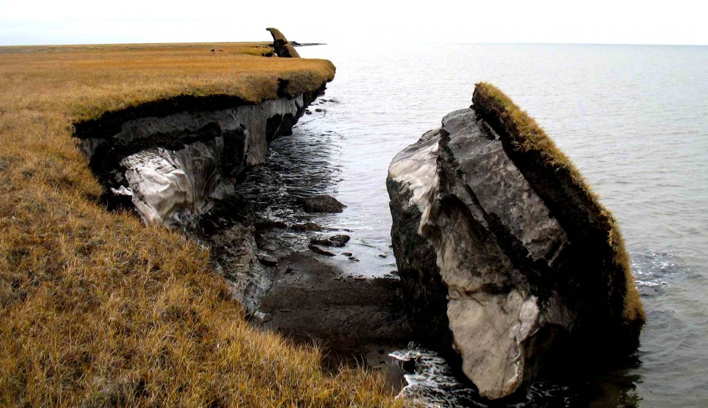
Most of northern Canada has a layer of permafrost that ranges from a few centimetres to hundreds of metres in thickness; the same applies in Alaska, Russia, and Scandinavia. Permafrost is a mixture of soil and ice (Figure 19.1.11), and it also contains a significant amount of trapped organic carbon that is released as CO2 and CH4 when the permafrost breaks down. Because the amount of carbon stored in permafrost is in the same order of magnitude as the amount released by burning fossil fuels, this is a feedback mechanism that has the potential to equal or surpass the forcing that has unleashed it.
In some polar regions, including northern Canada, permafrost includes methane hydrate (see section 18.3), a highly concentrated form of CH4 trapped in solid form. Breakdown of permafrost releases this CH4. Even larger reserves of methane hydrate exist on the sea floor, and while it would take significant warming of ocean water down to a depth of hundreds of metres, this too is likely to happen in the future if we don’t limit our impact on the climate. There is strong isotopic evidence that the Paleocene-Eocene thermal maximum (see Figure 19.0.1) was caused, at least in part, by a massive release of sea-floor methane hydrate.
There is about 45 times as much carbon in the ocean (as dissolved bicarbonate ions, HCO3−) as there is in the atmosphere (as CO2), and there is a steady exchange of carbon between the two reservoirs. But the solubility of CO2 in water decreases as the temperature goes up. In other words, the warmer it gets, the more of that oceanic bicarbonate gets transferred to the atmosphere as CO2. That makes CO2 solubility another positive feedback mechanism.
Vegetation growth responds positively to both increased temperatures and elevated CO2 levels, and so in general, it represents a negative feedback to climate change because the more the vegetation grows, the more CO2 is taken from the atmosphere. But it’s not quite that simple because when trees grow bigger and more vigorously, forests become darker (they have lower albedo) so they absorb more heat. Furthermore, climate warming isn’t necessarily good for vegetation growth; some areas have become too hot, too dry, or even too wet to support the plant community that was growing there, and it might take centuries for something to replace it successfully.
All of these positive (and negative) feedbacks work both ways. For example, during climate cooling, growth of glaciers leads to higher albedos, and formation of permafrost results in storage of carbon that would otherwise have returned quickly to the atmosphere.
Image Descriptions
Figure 19.1.2 image description: Our sun is roughly 4.5 billion years old. Over the next 5 billion years, it will continue getting warmer until it becomes a red giant. Six billion years from now, it will become a planetary nebula and then a white dwarf. [Return to Figure 19.1.2]
Figure 19.1.5 image description:
- The eccentricity of the Sun within the Earth's orbit goes through a 100,000 year cycle. The Earth's orbit around the sun can be very circular, but when it becomes more oval-shaped, the Sun is offset from the centre of the ellipse. This means that sometimes the Earth will be farther from the sun than normal and sometimes it will be closer to the sun than normal.
- The angle of tilt (or obliquity) or the Earth's axis goes through a 41,000 year cycle. When comparing the North Pole to a line perpendicular to the plane of the earth's orbit, the obliquity can range from 22.1° to 24.5°.
- The Earth's axial precession operates on a 20,000 year cycle.
Figure 19.1.9 image description: The albedo of Earth’s surfaces: Water=around 5%; Forest=10% to 15%; Sand=30%; Old snow and ice=70%; Cloud=75% to 85%. Fresh snow=90%. Earth’s average albedo is 30%. [Return to Figure 19.1.9]
Media Attributions
- Figure 19.1.1: © Steven Earle. CC BY.
- Figure 19.1.2: "Solar Life Cycle" by Oliverbeatson. Public domain.
- Figure 19.1.3: © Steven Earle. CC BY.
- Figure 19.1.4: "Coast Impact" by Don Davis, NASA. Public domain.
- Figure 19.1.5A: "Eccentricity zero" by NASA. Adapted by Steven Earle. Public domain.
- Figure 19.1.5B: "Earth obliquity range" by NASA. Public domain.
- Figure 19.1.5C: "Earth Precession" by NASA. Public domain.
- Figure 19.1.6: © Steven Earle. CC BY.
- Figure 19.1.7: © Steven Earle. CC BY. Based on data from Valerie Masson-Delmotte, "EPICA Dome C Ice Core 800KYr Deuterium Data and Temperature Estimates," WDCA Contribution Series Number : 2007 -091, NOAA/NCDC Paleoclimatology Program, Boulder CO, USA. Retrieved from: ftp://ftp.ncdc.noaa.gov/pub/data/paleo/icecore/antarctica/epica_domec/edc3deuttemp2007.txt and from Berger, A. and Loutre, M.F. (1991). Insolation values for the climate of the last 10 million years. Quaternary Science Reviews, 10, 297-317.
- Figure 19.1.8: "Multivariate ENSO Index (MEI)" by NOAA. Adapted by Steven Earle. Public domain.
- Figure 19.1.9: © Steven Earle. CC BY.
- Figure 19.1.10: "Clearcutting-Oregon" © Calibas. CC BY-SA.
- Figure 19.1.11: "Collapsed permafrost block of coastal tundra on Alaska’s Arctic Coast" by the USGS. Public domain.
Mining has always been a major part of Canada’s economy. Canada has some of the largest mining districts and deposits in the world, and for the past 150 years, we have been one of the world's most important suppliers of metals. Extraction of Earth’s resources goes back a long way in Canada. For example, the First Nations of British Columbia extracted obsidian from volcanic regions for tools and traded it up and down the coast. In the 1850s, gold was discovered in central British Columbia, and in the 1890s, even more gold was discovered in the Klondike area of Yukon. These two events were critical to the early development of British Columbia, Yukon, and Alaska.
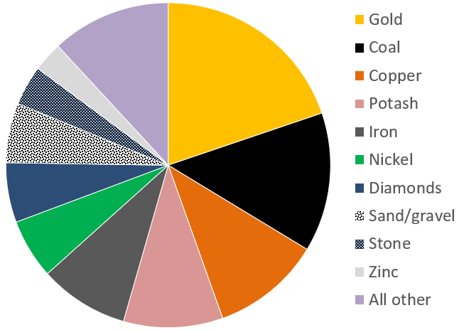
Canada’s mining sector had revenues in the order of $44 billion in 2017 (Figure 20.1.1). The 4 most valuable commodities were gold, coal, copper and potash, with important amounts from iron, nickel, diamonds, sand and gravel aggregates, stone and zinc. Revenues from the petroleum sector are significantly higher, at over $100 billion per year.
A metal deposit is a body of rock in which one or more metals have been concentrated to the point of being economically viable for recovery. Some background levels of important metals in average rocks are shown on Table 20.1, along with the typical grades necessary to make a viable deposit, and the corresponding concentration factors. Looking at copper, for example, we can see that while average rock has around 40 ppm (parts per million) of copper, a grade of around 10,000 ppm or 1% is necessary to make a viable copper deposit. In other words, copper ore has about 250 times as much copper as typical rock. For the other elements in the list, the concentration factors are much higher. For gold, it’s 2,000 times and for silver it’s around 10,000 times.
| Metal | Typical Background Level | Typical Economic Grade* | Concentration Factor |
|---|---|---|---|
| Copper | 40 ppm | 10,000 ppm (1%) | 250 times |
| Gold | 0.003 ppm | 6 ppm (0.006%) | 2,000 times |
| Lead | 10 ppm | 50,000 ppm (5%) | 5,000 times |
| Molybdenum | 1 ppm | 1,000 ppm (0.1%) | 1,000 times |
| Nickel | 25 ppm | 20,000 ppm (2%) | 800 times |
| Silver | 0.1 ppm | 1,000 ppm (0.1%) | 10,000 times |
| Uranium | 2 ppm | 10,000 ppm (1%) | 5,000 times |
| Zinc | 50 ppm | 50,000 ppm (5%) | 1,000 times |
| *It’s important to note that the economic viability of any deposit depends on a wide range of factors including its grade, size, shape, depth below the surface, and proximity to infrastructure, the current price of the metal, the labour and environmental regulations in the area, and many other factors. | |||
It is clear that some very significant concentration must take place to form a mineable deposit. This concentration may occur during the formation of the host rock, or after the rock forms, through a number of different types of processes. There is a very wide variety of ore-forming processes, and there are hundreds of types of mineral deposits. The origins of a few of them are described below.
Magmatic Nickel Deposits
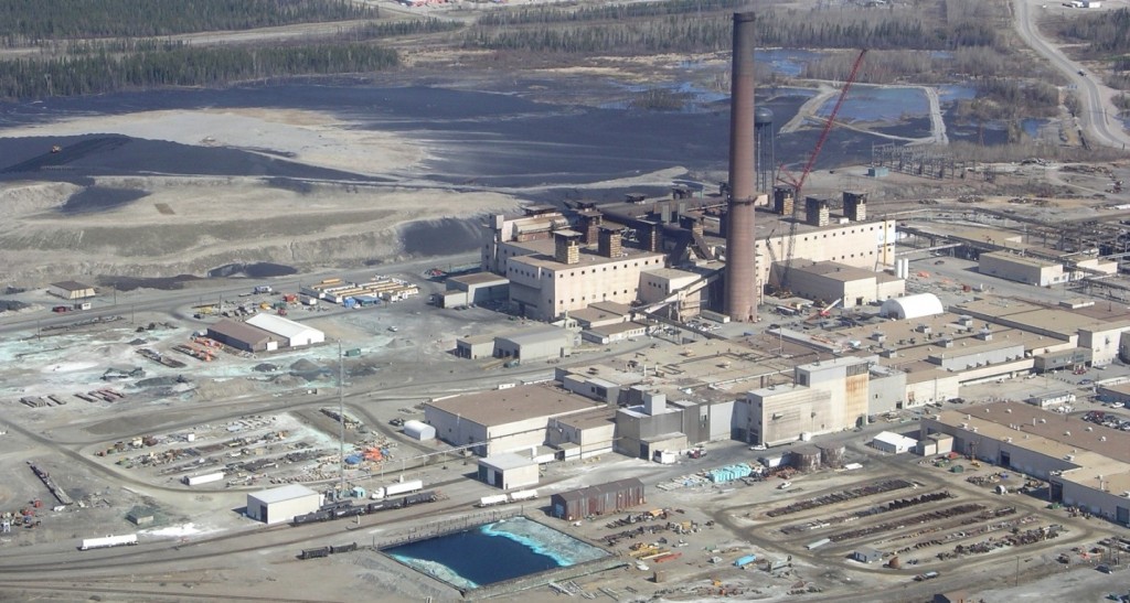
A magmatic deposit is one in which the metal concentration takes place primarily at the same time as the formation and emplacement of the magma. Most of the nickel mined in Canada comes from magmatic deposits such as those in Sudbury (Ontario), Thompson (Manitoba) (Figure 20.1.2), and Voisey’s Bay (Labrador). The magmas from which these deposits form are of mafic or ultramafic composition (derived from the mantle), and therefore they had relatively high nickel and copper contents to begin with (as much as 100 times more than normal rocks in the case of nickel). These elements may be further concentrated within the magma as a result of the addition of sulphur from partial melting of the surrounding rocks. The heavy nickel and copper sulphide minerals are then concentrated further still by gravity segregation (i.e., crystals settling toward the bottom of the magma chamber). In some cases, there are also significant concentrations of platinum-bearing minerals in magmatic deposits.
Most of these types of deposits around the world are Precambrian in age; the mantle was significantly hotter at that time, and the necessary mafic and ultramafic magmas were more likely to be emplaced in the continental crust.
Volcanogenic Massive Sulphide Deposits
Much of the copper, zinc, lead, silver, and gold mined in Canada is mined from volcanic-hosted massive sulphide (VHMS) deposits associated with submarine volcanism (VMS deposits). Examples are the deposits at Kidd Creek, Ontario, Flin Flon on the Manitoba-Saskatchewan border, Britannia on Howe Sound, and Myra Falls (within Strathcona Park) on Vancouver Island.

VMS deposits are formed from the water discharged at high temperature (250° to 300°C) at ocean-floor hydrothermal vents, primarily in areas of subduction-zone volcanism. The environment is comparable to that of modern-day black smokers (Figure 20.1.3), which form where hot metal- and sulphide-rich water issues from the sea floor. They are called massive sulphide deposits because the sulphide minerals (including pyrite (FeS2) , sphalerite (ZnS), chalcopyrite (CuFeS2), and galena (PbS)) are generally present in very high concentrations (making up the majority of the rock in some cases). The metals and the sulphur are leached out of the sea-floor rocks by convecting groundwater driven by the volcanic heat, and then quickly precipitated where that hot water enters the cold seawater, causing it to cool suddenly and change chemically. The volcanic rock that hosts the deposits is formed in the same area and at the same general time as the accumulation of the ore minerals.
Porphyry Deposits
Porphyry deposits are the most important source of copper and molybdenum in British Columbia, the western United States, and Central and South America. Most porphyry deposits also host some gold, and in rare cases gold is the primary commodity. B.C. examples include several large deposits within the Highland Valley mine (Figure 20.0.1) and numerous other deposits scattered around the central part of the province.

A porphyry deposit forms around a cooling felsic stock in the upper part of the crust. They are called “porphyry” because upper crustal stocks are typically porphyritic in texture, the result of a two-stage cooling process. Metal enrichment results in part from convection of groundwater related to the heat of the stock, and also from metal-rich hot water expelled by the cooling magma (Figure 20.1.4). The host rocks, which commonly include the stock itself and the surrounding country rocks, are normally highly fractured and brecciated. During the ore-forming process, some of the original minerals in these rocks are altered to potassium feldspar, biotite, epidote, and various clay minerals. The important ore minerals include chalcopyrite (CuFeS2), bornite (Cu5FeS4), and pyrite in copper porphyry deposits, or molybdenite (MoS2) and pyrite in molybdenum porphyry deposits. Gold is present as minute flakes of native gold.
This type of environment (i.e., around and above an intrusive body) is also favourable for the formation of other types of deposits—particularly vein-type gold deposits (a.k.a. epithermal deposits). Some of the gold deposits of British Columbia (such as in the Eskay Creek area adjacent to the Alaska panhandle), and many of the other gold deposits situated along the western edge of both South and North America are of the vein type shown in Figure 20.1.4, and are related to nearby magma bodies.
Banded Iron Formation
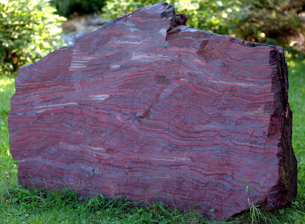
Most of the world’s major iron deposits are of the banded iron formation type, and most of these formed during the initial oxygenation of Earth’s atmosphere between 2,400 and 1,800 Ma. At that time, iron that was present in dissolved form in the ocean (as Fe2+) became oxidized to its insoluble form (Fe3+) and accumulated on the sea floor, mostly as hematite interbedded with chert (Figure 20.1.5). Unlike many other metals, which are economically viable at grades of around 1% or even much less, iron deposits are only viable if the grades are in the order of 50% iron and if they are very large.
Unconformity-Type Uranium Deposits
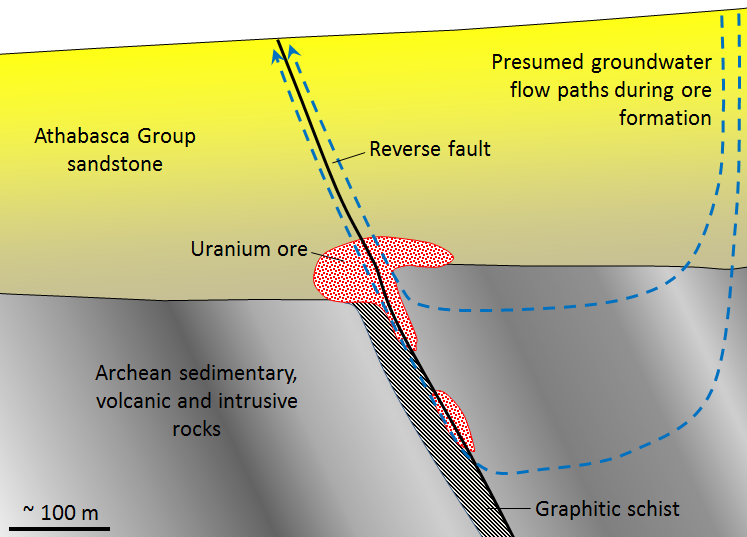
There are several different types of uranium deposits, but some of the largest and richest are those within the Athabasca Basin of northern Saskatchewan. These are called unconformity-type uranium deposits because they are all situated very close to the unconformity between the Proterozoic Athabasca Group sandstone and the much older Archean sedimentary, volcanic, and intrusive igneous rock (Figure 20.1.6). The origin of unconformity-type U deposits is not perfectly understood, but it is thought that two particular features are important: (1) the relative permeability of the Athabasca Group sandstone, and (2) the presence of graphitic schist within the underlying Archean rocks. The permeability of the sandstone allowed groundwater to flow through it and leach out small amounts of U, which stayed in solution in the oxidized form U6+. The graphite (C) created a reducing (non-oxidizing) environment that converted the uranium from U6+ to insoluble U4+, at which point it was precipitated as the mineral uraninite (UO2).
Exercise 20.2 The importance of heat and heat engines
For a variety of reasons, thermal energy (heat) from within Earth is critical in the formation of many types of ore deposits. Look back through the deposit-type descriptions above and complete the following table, describing which of those deposit types depend on a source of heat for their formation, and why.
| Deposit Type | Is heat a factor? | If so, what is the role of the heat? |
|---|---|---|
| Magmatic | ||
| Volcanogenic massive sulphide | ||
| Porphyry | ||
| Banded iron formation | ||
| Unconformity-type uranium |
See Appendix 3 for Exercise 20.2 answers.
Mining and Mineral Processing
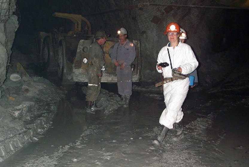
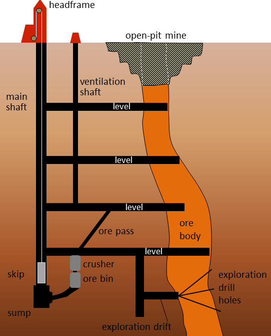
Metal deposits are mined in a variety of different ways depending on their depth, shape, size, and grade. Relatively large deposits that are quite close to the surface and somewhat regular in shape are mined using open-pit mine methods (Figure 20.0.1). Creating a giant hole in the ground is generally cheaper than making an underground mine, but it is also less precise, so it is necessary to mine a lot of waste rock along with the ore. Relatively deep deposits or those with elongated or irregular shapes are typically mined from underground with deep vertical shafts, declines (sloped tunnels), and levels (horizontal tunnels) (Figures 20.1.7 and 20.1.9). In this way, it is possible to focus the mining on the ore body itself. However, with relatively large ore bodies, it may be necessary to leave some pillars to hold up the roof.
In many cases, the near-surface part of an ore body is mined with an open pit, while the deeper parts are mined underground (Figures 20.1.8 and 20.1.9).

A typical metal deposit might contain a few percent of ore minerals (e.g., chalcopyrite or sphalerite), mixed with the minerals of the original rock (e.g., quartz or feldspar). Other sulphide minerals are commonly present within the ore, especially pyrite.
When ore is processed (typically very close to the mine), it is ground to a fine powder and the ore minerals are physically separated from the rest of the rock to make a concentrate. At a molybdenum mine, for example, this concentrate may be almost pure molybdenite (MoS2). The rest of the rock is known as tailings. It comes out of the concentrator as a wet slurry and must be stored near the mine, in most cases, in a tailings pond.
The tailings pond at the Myra Falls Mine on Vancouver Island and the settling ponds for waste water from the concentrator are shown in Figure 20.1.10. The tailings are contained by an embankment. Also visible in the foreground is a pile of waste rock, which is non-ore rock that was mined in order to access the ore. Although this waste rock contains little or no ore minerals, at many mines it contains up to a few percent pyrite. The tailings and the waste rock at most mines are an environmental liability because they contain pyrite plus small amounts of ore minerals. When pyrite is exposed to oxygen and water, it generates sulphuric acid—also known as acid rock drainage (ARD). Acidity itself is a problem to the environment, but because the ore elements, such as copper or lead, are more soluble in acidic water than neutral water, ARD is also typically quite rich in metals, many of which are toxic.
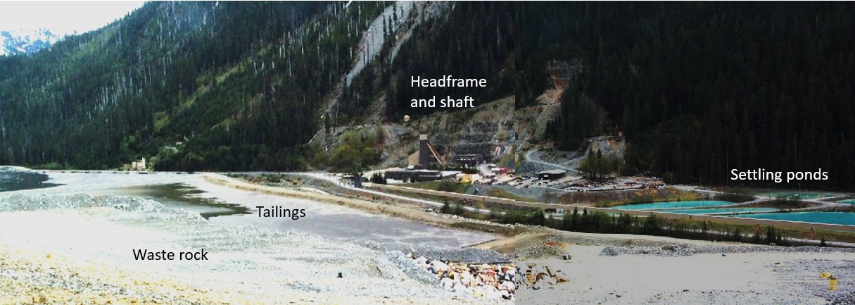
Tailings ponds and waste-rock storage piles must be carefully maintained to ensure their integrity and monitored to ensure that acidic and metal-rich water is not leaking out. In August 2014, the tailings pond at the Mt. Polley Mine in central B.C. failed and 10 million cubic metres of waste water along with 4.5 million cubic metres of tailings slurry was released into Polley Lake, Hazeltine Creek, and Quesnel Lake (Figure 20.1.11, a and b). As of 2019, the environmental implications of this event are still not fully understood.

Most mines have concentrators on site because it is relatively simple to separate ore minerals from non-ore minerals and this significantly reduces the costs and other implications of transportation. But separation of ore minerals is only the preliminary stage of metal refinement, for most metals the second stage involves separating the actual elements within the ore minerals. For example, the most common ore of copper is chalcopyrite (CuFeS2). The copper needs to be separated from the iron and sulphur to make copper metal and that involves complicated and very energy-intensive processes that are done at smelters or other types of refineries. Because of their cost and the economies of scale, there are far fewer refineries than there are mines.
There are several metal refineries (including smelters) in Canada; some examples are the aluminum refinery in Kitimat, B.C. (which uses ore from overseas); the lead-zinc smelter in Trail, B.C.; the nickel smelter at Thompson, Manitoba; numerous steel smelters in Ontario, along with several other refining operations for nickel, copper, zinc, and uranium; aluminum refineries in Quebec; and a lead smelter in New Brunswick.
Image Descriptions
Figure 20.1.8 image description: An open-pit mine is dug to access the ore that is near the surface. For ore farther down, an underground mine will be constructed to access the ore. This diagram shows the main shaft (a large vertical tunnel) with four levels (horizontal tunnels) connected to it. The levels run from the main shaft into the ore body. A ventilation shaft runs up through the four levels in between the main shaft and the ore for air circulation.
Media Attributions
- Figure 20.1.1: © Steven Earle. CC BY. Based on data from Natural Resources Canada.
- Figure 20.1.2: "Vale Nickel Mine" © Timkal. CC BY-SA.
- Figure 20.1.3 (left): "Black Smoker" by D. Butterfield, Univ. of Washington and J. Holden, Univ. Massachusetts Amherst. Public domain.
- Figure 20.1.3 (right): © Steven Earle. CC BY.
- Figure 20.1.4: © Steven Earle. CC BY.
- Figure 20.1.5: "Bestand: Black-band ironstone" © Aka. CC BY-SA.
- Figures 20.1.6, 20.1.7, 20.1.8, 20.1.9, 20.1.10, 20.1.11: © Steven Earle. CC BY.
- Figure 20.1.11 (left): "Mount Polley Mine site" by Visible Earth, NASA. Public domain.
- Figure 20.1.11 (right): "Mount Polley Mine site dam breach 2014" by Visible Earth, NASA. Public domain.
At the beginning of the Paleozoic (542 Ma), Laurentia was near the equator (Figure 21.1.1) and sedimentation was continuing on all of Laurentia’s marine margins, including the passive margin (not tectonically active) on what is now the west coast. The clastic sediments of the Windermere Group are succeeded by mostly limestone beds (represented by the blue areas in Figure 21.2.3) interbedded in some areas with mudstone and sandstone. The most famous Cambrian rocks in the Rockies are those around Field, B.C., within Yoho and Kootenay National Parks. The Burgess Shale of the Stephen Formation is considered by some to be the most important fossil bed in the world because of its spectacular preservation of detail in a wide array of organisms that are ancestors to many of today’s organisms and are not present in earlier rocks. The Walcott Quarry, on the pass between Mt. Field and Wapta Mountain has been known and studied for over 100 years (Figure 21.3.1). In 2012 a new Burgess Shale discovery was made at Marble Canyon, about 30 km to the southeast, by a team led by the Royal Ontario Museum (ROM). Fossils with similar levels of preservation are present, and several previously unknown organisms have been found. The ROM continues to work in the Marble Canyon area and some of their discoveries are described and illustrated on their website, such as a discovery of a large Burgess Shale fossil site in 2014. The Paleozoic strata of the Rockies also include Ordovician, Devonian, Carboniferous, and Permian sedimentary rocks. For example, Carboniferous limestone makes up most of the upper part of Crowsnest Mountain in southern Alberta (Figure 21.0.1).

While clastic and carbonate sediments were accumulating along the western edge of Laurentia, much of the interior of the continent was submerged under inland seas that were connected to ocean most of the time. This region is known as the Western Canada Sedimentary Basin (WCSB). The Paleozoic sediments that accumulated within this basin show up as the blue areas in Figures 21.1.3 and 21.2.1; however, their extent is much wider than that because Paleozoic sedimentary rocks also underly the Mesozoic rocks within most of the areas that are light green on those maps. By way of example, a schematic cross-section through the Paleozoic and Mesozoic rocks of southern Manitoba is given in Figure 21.3.2. The section extends from the Saskatchewan-Manitoba border on the left to just east of Winnipeg on the right, and shows the Paleozoic rocks overlain on the rocks of the Precambrian Superior Craton.
Fifteen different Paleozoic formations, ranging in age from Ordovician to Carboniferous, are shown in Figure 21.3.2. Of these, 11 are dominated by carbonate rocks (limestone or dolomite) that very likely formed in an ocean-connected marine environment. The non-carbonate formations are the lowermost one (resting on Precambrian rocks), which is sandstone of marine origin; the Devonian Prairie Evaporite Formation (in red)—the same formation from which potash is mined in Saskatchewan; and the upper two Devonian formations (in yellow), which are shale. When the Prairie Evaporite formed, the basin was isolated from the open ocean, and the rate of evaporation was greater than the rate of input from precipitation and river inflow. During that time, probably at least several million years, there were numerous changes in sea level or land level that allowed additional ocean water—and therefore additional salt—into the basin.

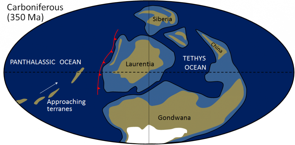
There are Paleozoic rocks in the central and western parts of British Columbia and Yukon, but they formed far away and did not become part of North America until the Mesozoic. Subduction started along the western edge of Laurentia by the middle Paleozoic. That meant that oceanic crust was moving toward the continent, bringing small segments of exotic continental crust with it (Figure 21.3.3). These crustal blocks along western North America are called terranes, indicating that they are sections of the continent that have an exotic origin (Figure 21.3.4). Most of British Columbia is made up of terranes that include sedimentary rocks with fossils that imply an origin south of the equator, or volcanic rocks with magnetic orientations that indicate a southern-hemisphere origin.
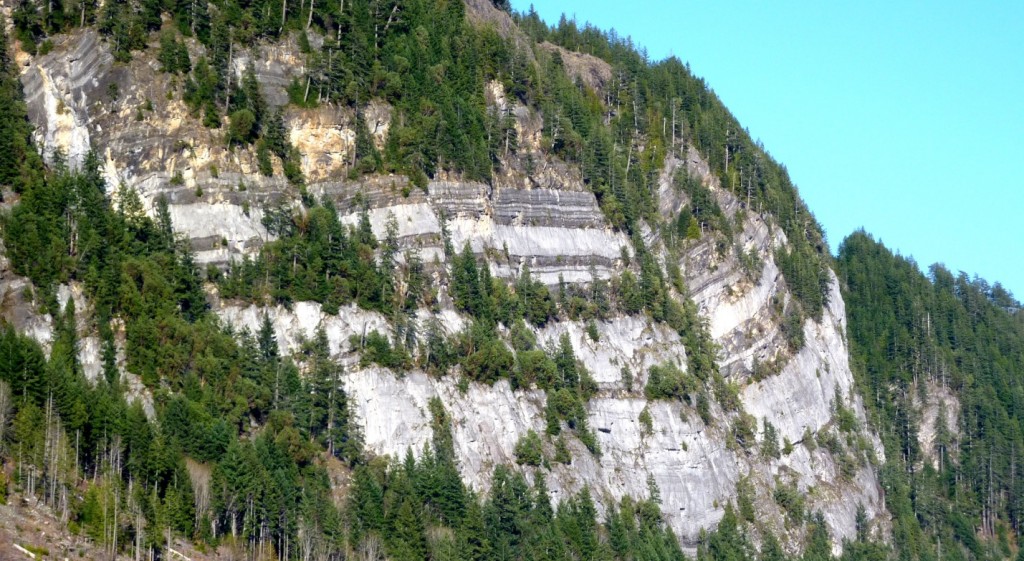
Exercise 21.3 What is Vancouver Island made of?
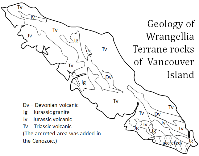
This map shows the main geological features of the Wrangellia Terrane rocks that were present when Vancouver Island arrived on the coast of North America.
- Roughly what percentage of Vancouver Island is underlain by Paleozoic rock?
- What is the most common age and type of rock on Vancouver Island?
To answer these questions, you might find it useful to fill in each rock type area using coloured pencils.
See Appendix 3 for Exercise 21.3 answers.
Media Attributions
- Figures 21.3.1, 21.3.2, 21.3.4, 21.3.5: © Steven Earle. CC BY.
- Figure 21.3.3: © Steven Earle. CC BY. Based on information from Christopher Scotese.
Learning Objectives
After carefully reading this chapter, completing the exercises within it, and answering the questions at the end, you should be able to:
- Describe what happened during the big bang, and explain how we know it happened
- Explain how clouds of gas floating in space can turn into stars, planets, and solar systems
- Describe the types of objects that are present in our solar system, and why they exist where they do
- Outline the early stages in Earth’s history, including how it developed its layered structure, and where its water and atmosphere came from
- Explain how the Moon formed, and how we know
- Summarize the progress so far in the hunt for habitable-zone planets outside of our solar system
- Explain why the planetary systems we have discovered so far raise questions about our model of how the solar system formed
The story of how Earth came to be is a fascinating contradiction. On the one hand, many, many things had to go just right for Earth to turn out the way it did and develop life. On the other hand, the formation of planets similar to Earth is an entirely predictable consequence of the laws of physics, and it seems to have happened more than once.
We will start Earth’s story from the beginning—the very beginning—and learn why generations of stars had to be born and then die explosive deaths before Earth could exist. We will look at what it takes for a star to form, and for objects to form around it, as well as why the nature of those objects depends on how far away from the central star they form.
Earth spent its early years growing up in a very rough neighbourhood, and we will discuss how Earth’s environment influenced its development, including how it got its moon from what was quite literally an Earth-shattering blow. This chapter will also discuss the hunt for Earth-like exoplanets (planets that exist outside of our solar system).
If by that you mean, are there other planets where we could walk out of a spaceship with no equipment other than a picnic basket, and enjoy a pleasant afternoon on a grassy slope near a stream, then that remains to be seen. On the other hand, if you are asking if other planets exist that are rocky worlds approximately Earth’s size, and orbiting within their star’s habitable zone (the zone in which liquid water, and potentially life, can exist), then many planet hunters are cautiously optimistic that we have found at least 12 such worlds so far.
As of July 2015, NASA’s Kepler mission has detected a total of 4,696 possible exoplanets. The Kepler spacecraft has an instrument to measure the brightness of stars, and looks for tiny variations in brightness that could be caused by a planet passing between the star it orbits and the instrument observing the star. Potential candidates are then examined in more detail to see whether they are in fact planets or not. So far 1,030 of those candidates have been confirmed as planets.[2] Of those, 12 satisfy the criteria of being one to two times the size of Earth, and orbiting their star within the habitable zone.[3]
The uncertainty about the 12 possible Earth-like worlds is related to their composition. We don’t yet know their composition; however, it is tempting to conclude that they are rocky because they are similar in size to Earth. Remember the rules of the accretion game: you can only begin to collect gas once you are a certain size, and how much matter you collect depends on how far away from the Sun you are. Given how large our gas giant and ice giant planets are compared to Earth, and how far away they are from the Sun, we would expect that a planet similar in size to Earth, and a similar distance from its star, should be rocky.
It isn’t quite as simple as that, however. We are finding that the rules to the accretion game can result in planetary systems very different from our own, leading some people to wonder whether those planetary systems are strange, or ours is, and if ours is strange, how strange is it?
Consider that in the Kepler mission’s observations thus far, it is very common to find planetary systems with planets larger than Earth orbiting closer to their star than Mercury does to the Sun. It is rare for planetary systems to have planets as large as Jupiter, and where large planets do exist, they are much closer to their star than Jupiter is to the Sun. To summarize, we need to be cautious about drawing conclusions from our own solar system, just in case we are basing those conclusions on something truly unusual.
On the other hand, the seemingly unique features of our solar system would make planetary systems like ours difficult to spot. Small planets are harder to detect because they block less of a star’s light than larger planets. Larger planets farther from a star are difficult to spot because they don’t go past the star as frequently. For example, Jupiter goes around the Sun once every 12 years, which means that if someone were observing our solar system, they might have to watch for 12 years to see Jupiter go past the Sun once. For Saturn, they might have to watch for 30 years.
So let’s say the habitable-zone exoplanets are terrestrial. Does that mean we could live there?
The operational definition of “other Earths,” which involves a terrestrial composition, a size constraint of one to two times that of Earth, and location within a star’s habitable zone, does not preclude worlds incapable of supporting life as we know it. By those criteria, Venus is an “other Earth,” albeit right on the edge of the habitable zone for our Sun. Venus is much too hot for us, with a constant surface temperature of 465°C (lead melts at 327°C). Its atmosphere is almost entirely carbon dioxide, and the atmospheric pressure at its surface is 92 times higher than on Earth. Any liquid water on its surface boiled off long ago. Yet the characteristics that make Venus a terrible picnic destination aren’t entirely things we could predict from its distance from the sun. They depend in part on the geochemical evolution of Venus, and at one time Venus might have been a lot more like a youthful Earth. These are the kinds of things we won’t know about until we can look carefully at the atmospheres and compositions of habitable-zone exoplanets.
Exercise 22.2 How well do we know the size of exoplanets?
One of the techniques for finding exoplanets is to measure changes in the brightness of a host star as the planet crosses in front of it and blocks some of its light. This diagram shows how the brightness changes over time. The dip in brightness reflects a planet crossing between the star and the instrument observing the star.
Often the planet itself is too small to see directly. If all we know is how the planet affects the brightness of the star, and we can’t even see the planet, then how do we know how big the planet is? The answer is that the two are related. We can write an equation for this relationship using the radius of the planet and the radius of the star.
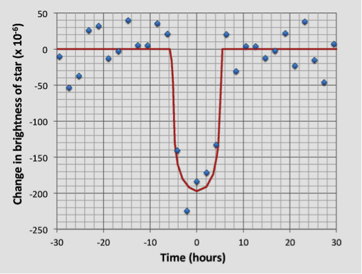

Let’s try this out for the Earth-like exoplanet called Kepler-452b. The first thing we need to know is the size of the host star Kepler-452. We can get that information by comparing its surface temperature and brightness to that of the sun. Start by calculating the ratios of the sun’s temperature to the star’s temperature, and the star’s luminosity to the sun’s luminosity using the data in Table 22.5. Record your answers in the table. Then find the star’s radius using the following equation, and record your result:

| Description | Sun | Kepler-452 | Ratio |
|---|---|---|---|
| Temperature (degrees Kelvin) | 5,778 | 5,757 | |
| Luminosity (× 1026 watts) | 3.846 | 4.615 | |
| Radius (km) | 696,300 |
The second thing we need to know is how the brightness of Kepler-452 changes as planet Kepler-452b moves in front of it. Use the plot shown in this exercise box to find this information. Find the value on the y-axis where the red curve shows the most dimming from the planet and record your result in Table 22.6.
| Decrease in brightness* | Earth radius in km | Kepler-452b radius in km | Kepler-452b radius/Earth radius |
|---|---|---|---|
| x 10−6 | 6,378 |
* Because we know this is a decrease, you don’t need to keep the negative sign.
Use the following equation to find the radius of Kepler-452b:

To put the size of Kepler-452b in perspective, divide its radius by that of Earth and record your answer.
See Appendix 3 for Exercise 22.2 answers.
Image Descriptions
Equation 2 image description: Star radius equals sun radius times begin fraction sun temperature over star temperature end fraction squared times begin square root begin fraction star luminosity over sun luminosity end fraction end square root. [Return to Equation 2]
Media Attributions
- Figure 22.5.1: © Karla Panchuk. CC BY. Based on data from Jenkins, J. et al, 2015, Discovery and validation of Kepler-452b: a 1.6REarth super Earth exoplanet in the habitable zone of a G2 star, Astronomical Journal, V 150, DOI 10.1088/0004-6256/150/2/56.
